
Table of contents
Table of contents
Website wireframes: The complete guide to getting your site structure right
Summary
In this guide, you'll discover:
- What a website wireframe is and why it matters for your design process
- How to create mobile-first wireframes that work across all devices
- Common wireframing mistakes and how to avoid them
- How AI-powered prototyping speeds up your wireframe-to-design workflow
- Real-world website wireframe examples and templates to get you started fast
What is a website wireframe? Everything you need to know
If you've ever built or redesigned a website, you've likely heard the term "wireframe" thrown around. But what is a website wireframe, and why is it such a vital part of the web design process? Whether you're a seasoned UX designer, a developer, or even part of a marketing team looking to understand your product's online presence better, this guide will walk you through everything you need to know about website wireframes. By the end, you'll be itching to sketch out your own.
Try Miro now
Join thousands of teams using Miro to do their best work yet.
Website wireframe explained
At its core, what is a website wireframe? It's like a blueprint for your website. It's a simplified visual guide that shows the basic structure of a webpage, without all the colors, images, and fancy fonts. Think of it like the skeleton of your site—it lays out where things like buttons, text, and images will go. You're essentially mapping out the user's journey through the site, giving everyone from designers to developers a clear vision of how things should work before diving into the nitty-gritty details.
Wireframes help visualize the hierarchy of your content, making it easy to communicate ideas to stakeholders or teammates. It's a way to map out functionality, ensuring that each element serves a purpose before jumping into design. Using wireframe templates can further simplify this process, providing a pre-built framework that speeds up planning and ensures consistency across pages.
Key elements of a website wireframe
Now that we know what a website wireframe is, let's dig into what it typically includes. Here are the most important elements to consider:
- Navigation (menus and links): Wireframes outline where the navigation elements will be placed to ensure users can easily move through your site.
- Header and footer areas: These are often static sections across most pages and include essential information like logos, contact details, and copyright information.
- Content sections: Whether it's text blocks, images, or videos, the wireframe shows where your core content will live on each page.
- CTAs (Call to Actions): Buttons that prompt users to take action, such as "Sign up," "Download," or "Buy now," are a must-have in any website wireframe.
- User flows: Wireframes help designers map out the user's journey through the site. It's a clear visual of how users will interact with each part of the website.
By focusing on these elements, your wireframe gives your team a cohesive view of how everything fits together before any development work begins. It's the key to staying aligned and preventing surprises down the line.
Website wireframe elements unpacked
Creating a wireframe is like sketching the blueprint for your website. It lays the groundwork for what's to come, ensuring that the final website is beautiful, functional, and user-friendly. Understanding the key elements in detail is crucial to truly harnessing the power of website wireframes. Let's dig deeper into each component that makes up the anatomy of a website wireframe.
1. Layout structure: The foundation
The layout structure is the backbone of your wireframe. It defines how content and interactive elements are organized across the page, ensuring a logical flow and an intuitive user experience. This includes:
- Grid systems: Using a grid helps in maintaining consistency across different pages, making your design more cohesive.
- White space: Balancing content with adequate white space improves readability and focuses user attention where it's needed.
- Visual hierarchy: Establishing a clear hierarchy guides users through your content in a deliberate way, emphasizing key elements like headlines and calls to action.
Wireframe tip: Show your grid in low-fi wireframes, then hide it in high-fi versions. It's a guide, not the final visual.
2. Navigation: The roadmap
Effective navigation is akin to a well-drawn map; it guides users to their desired destination with ease. In wireframes, navigation elements include:
- Menus: Whether it's a top navigation bar, sidebar, or dropdown menus, these elements outline how users will move through your site.
- Link placement: Identifying where to place links within your content helps in creating a seamless journey, encouraging exploration without confusion.
- Breadcrumb trails: For sites with multiple layers, breadcrumbs assist users in tracking their path and navigating back when needed.
Wireframe tip: Test your navigation with the "5-second rule" — can someone figure out where to go in under five seconds? If not, simplify.
3. Content placement: The storyteller
Content is the heart of your website, telling your brand's story. In wireframing, the placement of content elements dictates how this story unfolds:
- Headings and text: Mapping out where headings, subheadings, and body text go helps create a narrative flow.
- Images and icons: Placing visual elements like images and icons can break up text, making the content more digestible and engaging.
- Videos and interactive elements: Identifying spaces for multimedia enhances engagement, but it's crucial to balance these with the overall content strategy.
Wireframe tip: Use size and weight to establish hierarchy even in grayscale. Make primary headlines larger than secondary ones. Give body text a comfortable reading space.
4. Functionality: The interaction
A wireframe also outlines how users will interact with the site. This encompasses:
- Call-to-action (CTA) buttons: Strategic placement of CTAs guides users towards taking desired actions, be it signing up, making a purchase, or learning more.
- Forms: Placement and design of forms for newsletter sign-ups, contact information, or search bars are crucial for user interaction.
- Interactive elements: Planning for sliders, tabs, or accordion elements that don't overwhelm the user but enhance the experience.
Wireframe tip: Distinguish primary CTAs (main action) from secondary CTAs (alternative action). Primary buttons should be more prominent — larger, bolder, more visually distinct.
5. Branding elements: The personality
Even in the skeletal phase, incorporating placeholders for branding elements is essential. This includes:
- Logo: A placeholder for the logo sets the stage for brand presence, typically at the top of the page.
- Color scheme: While detailed design isn't the focus, indicating areas for brand colors can aid in visual planning.
- Fonts and typography: Noting font hierarchies and styles ensures that the wireframe aligns with brand identity, even if specific designs are not yet finalized.
Wireframe tip: Use simple boxes for logo placement. Note font hierarchies ("Headline: Bold, 32px / Body: Regular, 16px"). Detailed branding comes later — this is about space and structure.
Each element of a wireframe is essential for outlining a website's design and functionality. By focusing on the layout structure, navigation, content placement, functionality, and branding elements, you develop a blueprint that ensures the final website is not only visually appealing but also an exemplary model of user experience and functionality. Remember, a well-crafted wireframe is the first step in turning your vision into a digital reality.
When you need a website wireframe (and when you don't)
Let's be honest: Not every project needs a full website wireframe. Sometimes you're better off sketching on a board or jumping straight into design. Here's how to decide.
You definitely need a website wireframe when:
1. You're building a website from scratch
New projects = endless possibilities = easy to lose direction. Wireframes keep you focused on structure before you get distracted by colors and fonts.
2. You're redesigning a complex existing site
Overhauling multi-page sites with intricate user flows? Wireframes help you map out the new structure without losing critical functionality.
3. Multiple stakeholders are involved
Wireframes give everyone — designers, developers, product managers, executives — a shared vision. They prevent expensive misalignment.
4. You're working on projects with complex user flows
E-commerce checkouts, multi-step forms, SaaS onboarding — anything with conditional logic or branching paths benefits from wireframe planning.
5. You need to test usability before investing in design
Clickable wireframes let you run usability tests early. Catch navigation problems before designers spend weeks on high-fidelity mockups.
You might not need a website wireframe when:
1. You're making minor updates to existing pages
Swapping out a hero image? Updating copy on a single section? No need for a full wireframe. Just make the change.
2. You have a very simple, single-page project
A basic landing page with one CTA and minimal content? A quick sketch might be enough.
3. You're working alone with a clear vision
Solo founders or freelancers who know exactly what they want can sometimes skip formal wireframing. (Though you might regret it later when clients ask for changes.)
4. You're prototyping to explore ideas, not finalize structure
Sometimes you're in pure discovery mode — testing concepts, not locking down layouts. In these cases, rough sketches or low-fi prototypes work better than formal wireframes.
The bottom line: When in doubt, wireframe. It takes less time upfront than fixing structural problems later.
Tips on how to create website wireframes like a pro
Creating effective wireframes doesn't happen by accident. Here's how to refine your process:
- Start with a goal: Every wireframe should begin with a clear understanding of what you want the page to achieve. Keep user actions and conversions in mind.
- Go low-fi to start: Begin with low-fidelity sketches to explore ideas quickly. Use pen and paper or simple drawing tools to iterate fast.
- Use real content when possible: Placeholder text has its place, but using real content, even in draft form, can help better understand space and layout needs.
- Prioritize usability over design: Focus on creating a logical flow and intuitive navigation. Pretty comes later.
- Feedback loop: Share early and often with your team. Wireframing is collaborative, and fresh eyes can spot issues or improvements you might miss.
- Keep accessibility in mind: Plan for accessible design from the start. Consider how elements can be adapted for all users, including those with disabilities.
Building website wireframes with Miro: AI-powered prototyping
Most wireframing tools make you choose: fast and rough, or detailed and time-consuming. Miro gives you both — and adds AI to make the whole process faster.
Start with ready-made wireframe templates
Don't start from scratch if you don't have to. Miro's template library includes wireframes for:
- Landing pages (hero sections, feature grids, testimonials, CTAs)
- E-commerce product pages (image galleries, product specs, reviews, checkout)
- SaaS dashboards (navigation, data visualizations, user settings)
- Blog and content layouts (article pages, category archives, sidebars)
- Mobile app screens (onboarding flows, profile pages, settings)
Pick a template, customize it for your project, and you're wireframing in minutes instead of hours.
👉 Browse Miro's wireframe template library →
Use AI to generate website wireframes from prompts
Here's where things get interesting. Instead of manually dragging boxes around, you can use Miro's AI features to generate wireframe layouts from natural language prompts.
How it works:
Step 1: Open the AI Sidekicks menu
Select "Prototyping" from the format options.
Step 2: Describe what you want
Write a detailed prompt describing your wireframe needs:
Example prompt: "Create a mobile wireframe for an e-commerce product page. Include: product image at top, product name and price below, size selector dropdown, add to cart button, product description section, customer reviews, and related products carousel at bottom."
Step 3: Let AI generate the wireframe
Miro AI analyzes your prompt and creates a structured wireframe layout with all the elements you specified. It handles spacing, hierarchy, and mobile-friendly layouts automatically.
Step 4: Refine with follow-up prompts
Not perfect? Keep prompting:
- "Move the add to cart button higher, right below the size selector"
- "Make the product image section larger and add zoom indicators"
- "Add a sticky header with back button and shopping cart icon"
Miro AI refines your wireframe based on each instruction — no manual repositioning needed.
Turn wireframes into interactive prototypes with AI
Static wireframes are great for structure, but interactive prototypes show how users actually move through your site. Miro AI helps you add interactivity without coding or complicated linking.
Creating clickable prototypes:
1. Select your wireframe elements
Highlight the wireframe frames you want to make interactive.
2. Open the Miro Sidekicks AI context menu
Click Prototype in the toolbar above your selection.
3. Convert to prototype
Choose "Create prototype from wireframes." Miro AI automatically:
- Links frames based on buttons and navigation elements
- Adds realistic transition animations
- Creates a click-through experience you can test immediately
4. Test the user flow
Click "Present" mode to experience your wireframe as an interactive prototype. Click buttons, navigate between pages, and see if the user flow makes sense.
5. Share for feedback
Send the prototype link to stakeholders, team members, or test users. They don't need a Miro account — just click and explore.
AI-powered design iteration on your website wireframe
The real power of AI wireframing isn't just speed — it's the ability to explore multiple directions quickly.
Try this workflow:
- Generate three variations: Prompt Miro AI to create three different homepage layouts with the same content but different structures (centered hero, side-by-side layout, full-width banner).
- Compare side-by-side: Place all three variations on the same Miro board. Add team comments and voting stickers to gather quick feedback.
- Combine the best elements: Pick the hero section from Version A, the feature grid from Version B, and the footer from Version C. Prompt Miro AI to combine them into one refined wireframe.
- Add annotations: Use Miro's commenting and documentation features to add notes about interactions, responsive behavior, and content requirements.
This iterative approach — made fast by AI — helps you explore more ideas without spending weeks in wireframe purgatory.
When to use AI vs manual website wireframing
Use AI website wireframing when:
- You need to explore multiple layout options quickly
- You're working on standard page types (landing pages, product pages, dashboards)
- You want to generate a starting point and refine from there
- You need to create prototypes for user testing fast
Manual website wireframing still wins when:
- You're designing something highly custom with unique interaction patterns
- You need pixel-perfect control over every element
- You're doing detailed annotation and specification work
- You're collaborating synchronously with your team in real-time
The best workflow? Use AI to generate initial wireframes quickly, then refine manually to add the nuance and detail your specific project needs.
Miro's complete website wireframing toolkit
Beyond AI, Miro gives you everything you need for effective wireframing:
Visual context processing: Select existing content on your board — sketches, user research, competitor screenshots — and prompt Miro AI to generate wireframes based on that context. Your wireframes reflect actual project requirements, not generic templates.
Real-time collaboration: Wireframe with your entire team simultaneously. Designers sketch layouts, product managers add requirements, developers flag technical constraints — all on the same infinite canvas.
Integrations with design tools: Export wireframes to Figma, Adobe XD, or Sketch for visual design. Or import existing designs into Miro for collaborative review and iteration.
Built-in presentations: Present wireframes to stakeholders directly in Miro. No need to export to PowerPoint — just create frames and present your wireframe flow like slides.
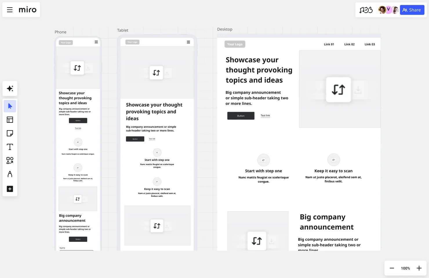
How to create mobile-first website wireframes
Here's a reality check: More users will see your site on mobile than desktop. Yet many teams still design desktop-first and awkwardly squeeze everything into a mobile view later.
Mobile-first wireframing flips this approach — you start with the smallest, most constrained screen and progressively enhance for larger devices. This ensures your core experience works everywhere, not just on big screens.
Why mobile-first matters
1. It forces prioritization Limited mobile screen space means you can't fit everything. You have to decide: What's essential? What can wait? This ruthless prioritization actually improves your desktop experience too — turns out, less clutter works everywhere.
2. Touch targets and gestures matter Desktop users click with precise mouse cursors. Mobile users tap with thumbs — which are way less accurate. Mobile-first wireframing forces you to think about:
- Are buttons big enough to tap easily?
- Is navigation reachable with one hand?
- Do interactive elements have enough spacing to prevent mis-taps?
3. Performance and load times Mobile users often deal with slower connections. Mobile-first design naturally leads to leaner, faster experiences because you're not cramming desktop complexity into a small screen.
Key differences: Mobile vs desktop wireframes
Navigation patterns:
- Desktop: Horizontal navigation bars with dropdowns
- Mobile: Hamburger menus, bottom navigation, or tab bars
Content layout:
- Desktop: Multi-column grids, sidebar content, wider text blocks
- Mobile: Single-column stacking, collapsible sections, shorter paragraphs
Interaction design:
- Desktop: Hover states, tooltips, keyboard shortcuts
- Mobile: Swipe gestures, pull-to-refresh, long-press actions
Image and media:
- Desktop: Larger hero images, multiple images side-by-side
- Mobile: Smaller images, image carousels, vertical scrolling galleries
Mobile wireframe checklist
Before you call your mobile wireframe done, ask yourself:
Touch targets & spacing
- Are all buttons at least 44x44 pixels (Apple's recommendation)?
- Is there enough spacing between tap targets to prevent mistakes?
- Can users easily tap navigation with their thumb?
Content & readability
- Does the most important content appear first?
- Are text blocks short enough to read comfortably on small screens?
- Have you minimized horizontal scrolling?
Navigation & usability
- Is primary navigation accessible from every screen?
- Can users complete key tasks without excessive scrolling?
- Are form fields optimized for mobile keyboards?
Performance considerations
- Have you minimized large images or videos that slow load times?
- Does your layout work offline or on slow connections?
Responsive breakpoint planning
Don't just create one mobile wireframe and one desktop wireframe. Think about the breakpoints in between:
Common breakpoints to wireframe:
- Mobile: 320px - 767px (portrait phones, landscape phones)
- Tablet: 768px - 1023px (iPads, Android tablets)
- Desktop: 1024px+ (laptops, desktop monitors)
Wireframe how your layout adapts at each breakpoint. Does your two-column grid become single-column on mobile? Where does your sidebar content go? How does navigation transform?
Planning these transitions in your wireframes prevents awkward in-between states where your site looks broken.
Website wireframe examples and templates to get started
Sometimes the best way to learn wireframing is to see it in action. Here are proven wireframe templates for common website types — all ready to customize in Miro.
Homepage wireframes
What they typically include:
- Hero section with headline, subheadline, and primary CTA
- Value proposition or benefit statements
- Feature showcase (often in three or four columns)
- Social proof (logos, testimonials, case studies)
- Secondary CTA and footer navigation
👉 Use Miro's Homepage Wireframe Template
E-commerce product page wireframes
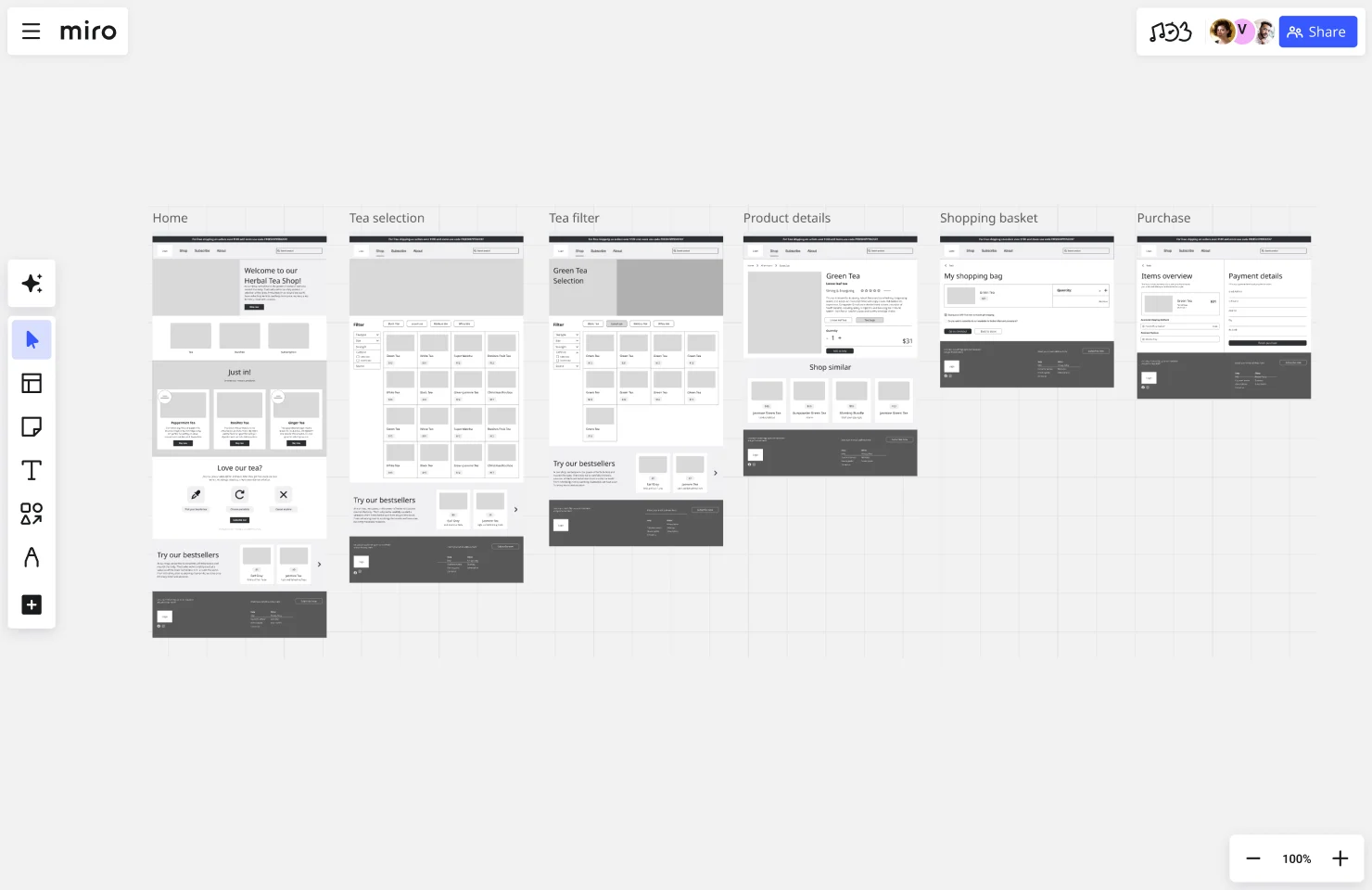
What they typically include:
- Product image gallery with zoom and multiple views
- Product name, price, and availability status
- Size/color/variant selectors
- Add to cart button and quantity selector
- Product description and specifications tabs
- Customer reviews and ratings
- Related products or upsells
Best practices: Keep the add-to-cart button above the fold on mobile. Show clear product imagery before detailed descriptions.
👉 Use Miro's Ecommerce Wireframe Template
Organization landing page wireframes
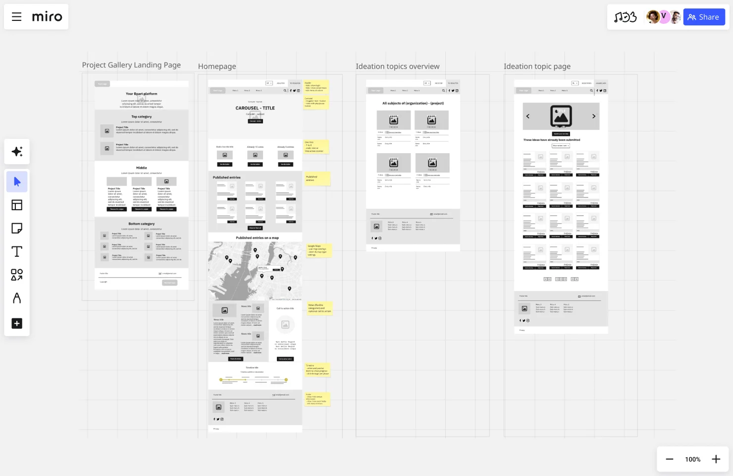
What they typically include:
- Clear value proposition in headline
- Org demo video or animated company tour
- Values breakdown
- FAQ section addressing common objections
- Multiple CTAs throughout the page
Best practices: Make it easy to sign up or book a demo at every scroll depth.
👉 Use Miro's Organization Website Wireframe Template
Blog and article page wireframes
What they typically include:
- Article headline and author byline
- Featured image or hero graphic
- Body content with proper typography hierarchy
- Table of contents or jump links (for long articles)
- Related articles or recommended reading
- Newsletter signup or lead capture
- Comment section or social sharing
Best practices: Optimize for readability — wide margins, comfortable line length, clear hierarchy. Surface related content to keep users engaged.
Mobile app wireframes
What they typically include:
- Bottom navigation or tab bar
- Top header with back button and title
- Primary content area with touch-friendly sizing
- Floating action button (FAB) for primary actions
- Pull-to-refresh and infinite scroll patterns
- Empty states and loading indicators
Best practices: Design for thumb reach — put important actions within easy tap zones. Use familiar mobile patterns so users don't have to learn custom interactions.
Dashboard and admin wireframes
What they typically include:
- Left or top navigation with main sections
- Data visualizations (charts, graphs, metrics)
- Filtering and sorting controls
- Action buttons for CRUD operations
- User settings and account management
- Notifications and activity feeds
Best practices: Prioritize data over decoration. Make complex information scannable. Provide quick actions without requiring multiple clicks.
Website flowchart and sitemap templates
Before you wireframe individual pages, map out the overall structure:
Website Flowchart Template — Visualize the user's journey through your site. Show decision points, conditional paths, and conversion funnels.
Sitemap Template — Organize your site's hierarchy. See how pages connect, identify navigation patterns, and ensure no orphaned content.
Taking your website wireframes further
You've wireframed your site. Now what? Here's how to turn those structural blueprints into a finished website without losing momentum.
From wireframe to mockup
Wireframes show structure. Mockups add visual design — colors, typography, images, branding.
The handoff:
- Designers use wireframes as blueprints, layering in visual elements while maintaining the structure you've validated.
- If you've annotated your wireframes well (interaction notes, content specs, responsive behavior), designers won't need to guess what you intended.
Pro tip: Review mockups against wireframes to ensure the structure didn't change accidentally. Sometimes visual design unintentionally shifts layouts in ways that hurt usability.
From wireframe to development
Developers turn your wireframes into code. The clearer your wireframes, the smoother this process.
What developers need from your wireframes:
- Interaction annotations (what happens when users click/tap)
- Responsive breakpoint specs (how layouts adapt at different screen sizes)
- Content specifications (character limits, image dimensions, dynamic vs static content)
- Accessibility notes (alt text, ARIA labels, keyboard navigation)
Pro tip: Walk through wireframes with your dev team before they start coding. Answer questions early to prevent mid-development confusion.
From wireframe to user testing
You don't need a fully designed site to test usability. Clickable wireframe prototypes work great for early testing.
What to test:
- Can users find key information?
- Do they understand the navigation?
- Can they complete critical tasks (sign up, make a purchase, submit a form)?
- Where do they get confused or stuck?
Tools for wireframe testing:
- Miro: Create clickable prototypes directly from wireframes, share links with test users
- UserTesting.com: Upload wireframe prototypes and get video feedback from real users
- Maze: Run unmoderated usability tests on wireframe prototypes
Pro tip: Test early, test often. One round of wireframe testing can save weeks of redesign work later.
Common website wireframing mistakes (and how to avoid them)
Even experienced designers fall into these traps. Here's what to watch out for — and how to fix it before it becomes a problem.
Mistake #1: Starting with high-fidelity instead of low-fidelity
The problem: You spend hours perfecting a detailed wireframe, only to realize the fundamental structure doesn't work. Now you're reluctant to scrap all that effort, so you try to salvage a flawed approach.
The fix: Always start with rough, low-fidelity sketches. Test the basic structure first. Only add detail once you've validated that the layout actually solves the user's problem.
Why it matters: Low-fi wireframes are disposable. It's easier to throw away a 10-minute sketch than a 4-hour detailed wireframe. Speed early, precision later.
Mistake #2: Skipping mobile wireframes
The problem: You design a beautiful desktop layout, then realize it doesn't work on mobile. Now you're cramming desktop components into a tiny screen, resulting in awkward layouts, tiny buttons, and frustrated mobile users.
The fix: Start with mobile wireframes first. Design for the smallest, most constrained screen, then progressively enhance for larger devices. This "mobile-first" approach ensures your core experience works everywhere.
Why it matters: More than 60% of web traffic comes from mobile devices. If your site doesn't work on mobile, you're failing the majority of your users.
Mistake #3: Using Lorem Ipsum instead of real content
The problem: You fill your wireframe with placeholder text like "Lorem ipsum dolor sit amet..." because you don't have final copy yet. When real content arrives, it's either way too long or too short — breaking your carefully designed layout.
The fix: Use realistic draft content, even if it's rough. A headline that says "How to Build a Website in 7 Days" gives you a much better sense of space than "Lorem ipsum dolor sit amet."
Why it matters: Real content reveals real problems. That beautiful three-column layout? Doesn't work when one headline is three words and another is fifteen. Catch these issues in the wireframe stage, not after development.
Mistake #4: Overcomplicating early wireframes
The problem: You try to show every interaction, every edge case, and every possible user flow in your initial wireframe. The result? A confusing, cluttered mess that overwhelms stakeholders and doesn't actually answer the core structural questions.
The fix: Start simple. Focus on the happy path — the ideal user journey with no errors or complications. Once that's validated, layer in complexity gradually.
Why it matters: Clarity beats comprehensiveness at the wireframe stage. You need stakeholders to understand the structure, not drown in details. Keep it simple until the basics are right.
Mistake #5: Ignoring visual hierarchy
The problem: Everything on your wireframe looks equally important. There's no clear entry point, no visual flow guiding users' eyes. When users land on the page, they don't know where to look first.
The fix: Use size, weight, and spacing to establish hierarchy even in grayscale wireframes. Make headlines bigger than body text. Give primary CTAs more visual weight than secondary actions. Create breathing room around important elements.
Why it matters: Visual hierarchy guides user attention. If everything screams for attention equally, nothing actually gets noticed. Establish hierarchy early, and your visual designer will thank you.
Mistake #6: Not considering developer handoff needs
The problem: Your wireframe looks great, but developers can't figure out how to build it. There are no annotations about interactions, no notes about breakpoints, no clarity on what happens when users click buttons.
The fix: Add clear annotations and interaction notes. Specify:
- What happens when users click or tap elements
- How layouts respond at different screen sizes
- Where dynamic content comes from
- Any special behaviors or conditional logic
Why it matters: Wireframes aren't just for designers and stakeholders — they're blueprints for developers. Make their job easier by providing clear, actionable specifications.
Mistake #7: Working in isolation
The problem: You create a brilliant wireframe in a vacuum, present it to stakeholders, and get hit with a flood of unexpected feedback. Now you're redesigning from scratch because critical requirements were never discussed.
The fix: Collaborate early and often. Share rough sketches with stakeholders before investing time in detailed wireframes. Get input from developers about technical constraints. Talk to actual users about their needs.
Why it matters: Wireframing is a collaborative process. The more perspectives you incorporate early, the less rework you'll face later.
Mistake #8: Not testing wireframes with users
The problem: You assume your wireframe structure makes sense because it's logical to you. Then users test the actual site and get completely lost — they can't find key features, they don't understand the navigation, and they abandon critical tasks.
The fix: Test wireframes with real users before moving to visual design. You don't need a coded prototype — clickable wireframes work fine. Watch users attempt key tasks and note where they get confused.
Why it matters: You are not your user. What seems obvious to you might be incomprehensible to someone who's never seen your product. Test early, learn fast, iterate before development begins.
Real-world success: How Karma used Miro wireframes to build a product 1.3 million users love
Wireframes aren't just theory — they're the foundation of products people actually use. Here's how one remote team turned wireframes into a thriving SaaS business.
The challenge: Building a complex product with a fully remote team
When Karma's founding team decided to build an employee engagement tool, they faced a common startup dilemma: How do you design, develop, and iterate on a complex product when your UX designers, programmers, product managers, and users are scattered across different time zones?
Traditional wireframing methods — gathering in conference rooms, sketching on whiteboards, taking photos to share with remote team members — wouldn't work for a team that had never met in person.
The solution: Collaborative wireframing in Miro
Karma's team used Miro's infinite canvas to wireframe different layout options and present them directly to users in remote workshops.
Here's what made their wireframing process work:
Asynchronous collaboration: Team members in New Zealand, Russia, and other time zones contributed wireframes and feedback around the clock. "You wake up in the morning in New Zealand and the team in Russia has already done the work planned the day before, leaving comments on the board," says David Kravitz, Managing Director at Karma.
User feedback sessions: Instead of presenting static wireframe documents, Karma conducted live workshops where users could see multiple wireframe layouts, vote on preferences, and suggest changes in real-time using Miro's commenting and voting features.
Rapid iteration: When user feedback revealed that customers loved Karma's positive reinforcement features, the team quickly wireframed new Achievement boards and removed negative feedback capabilities — all without expensive redesign cycles.
The results: From wireframe to 1.3 million users
Today, over 1.3 million users on 20,000 teams use Karma for daily appreciation, recognition, and rewards. Giants like Microsoft, VMware, Electronic Arts, and Kaiser Permanente adopted the platform.
Key takeaway from Karma's founder Stas Kulesh:
"The speed of developing a startup project from idea to product development is one of the key factors in its success. Our remote team was able to grow a complex product in about a year. Versatile, multi-functional, and flexible tools like Miro allowed us to achieve maximum efficiency throughout the development process."
What Karma's story teaches us about effective wireframing:
- Wireframes work best when users can see and interact with them directly
- Remote collaboration doesn't slow down wireframing — it can actually speed it up with async workflows
- Multiple wireframe variations help teams test ideas before committing to development
- The faster you can wireframe and iterate, the faster you can build products people love
Read the full Karma case study →
Take your website wireframe to the next level with Miro
Creating a website wireframe is a crucial step, but it doesn't have to be a complicated one. With Miro's innovation workspace, you have everything you need to sketch out your website's structure, collaborate with your team in real time, and iterate faster with tools like Miro AI. And with our extensive library of ready-made templates, building your wireframe is as easy as drag-and-drop.
Whether you're a UX designer mapping out a seamless user journey or a marketer trying to visualize your next campaign landing page, Miro gives you the flexibility and collaboration features to turn your wireframe into a working reality. And now, with Miro's new AI-powered prototyping features, you can take those wireframes even further. Effortlessly transform your static layouts into interactive prototypes, allowing you to build out user flows, test concepts, and gather feedback on a more dynamic representation of your site faster than ever. Start exploring what Miro can do for your wireframing process today.
FAQs about website wireframes
What's the difference between a wireframe and a mockup?
Wireframe: Low-fidelity structural blueprint showing layout and functionality without visual design.
Mockup: High-fidelity visual representation including colors, typography, images, and branding.
Analogy: Wireframes are architectural blueprints. Mockups are the finished building with paint, furniture, and decor.
How long should wireframing take?
It depends on project complexity:
- Simple landing page: 1-2 hours
- Multi-page marketing site: 1-2 days
- E-commerce site: 3-5 days
- Complex SaaS product: 1-2 weeks
Remember: Speed up by starting with templates and using AI-assisted wireframing tools like Miro.
Can I skip wireframing and go straight to design?
You can, but you probably shouldn't. Skipping wireframes often leads to:
- Structural problems discovered mid-design (forcing redesigns)
- Misalignment between stakeholders (requiring rework)
- Developers building the wrong thing (expensive fixes)
Wireframes save more time than they take.
Should I wireframe every page of my website?
Wireframe these pages thoroughly:
- Homepage (often the most-visited page)
- Key conversion pages (product pages, pricing, checkout)
- Any page with complex user flows or interactions
You can skip detailed wireframes for:
- Simple static pages with repetitive layouts (blog posts, basic content pages)
- Pages using established templates
Focus your wireframing effort where structure matters most.
What resolution should wireframes be?
Common breakpoints to consider:
- Mobile: 375px width (iPhone standard)
- Tablet: 768px width (iPad portrait)
- Desktop: 1440px width (standard laptop screen)
Wireframe at the smallest relevant size first (usually mobile), then show how layouts adapt for larger screens.
How do I wireframe for accessibility?
Include these considerations in your wireframes:
- Clear content hierarchy for screen readers
- Sufficient color contrast (even in grayscale wireframes, show contrast differences)
- Touch/click target sizing (minimum 44x44px for mobile)
- Keyboard navigation flow (indicate tab order if complex)
- Alt text placeholders for images
- Form labels and error message placement
Pro tip: Annotate accessibility requirements directly on wireframes so designers and developers don't forget them later.
What's the difference between a wireframe and a sitemap?
Sitemap: Shows the overall structure and hierarchy of your entire website — how pages connect and relate to each other.
Wireframe: Shows the layout and content structure of individual pages.
Use both: Start with a sitemap to plan your site's architecture, then wireframe individual pages to design their layouts.
How do wireframes fit into agile development?
In agile workflows, wireframes help quickly validate ideas before each sprint. Common approach:
- Sprint planning: Wireframe upcoming features
- Team review: Gather quick feedback, iterate
- Sprint execution: Design and develop validated wireframes
- Retrospective: Identify what worked, what didn't
Wireframes keep agile teams aligned without slowing down sprint velocity.
Author: Miro Team Last update: December 9, 2025