About the Miro yes no flowchart template
Taking a logical and systematic approach to decision-making can significantly improve the efficiency of project planning and execution. We understand that at Miro, which is why we created our yes no flowchart template.
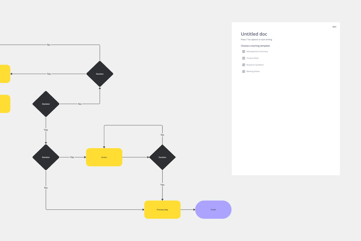
The Miro yes no flowchart template helps organizations visualize decision points and their subsequent outcomes quickly and easily. By using predefined graphical representations, people and teams can map out binary decisions and actions with ease.
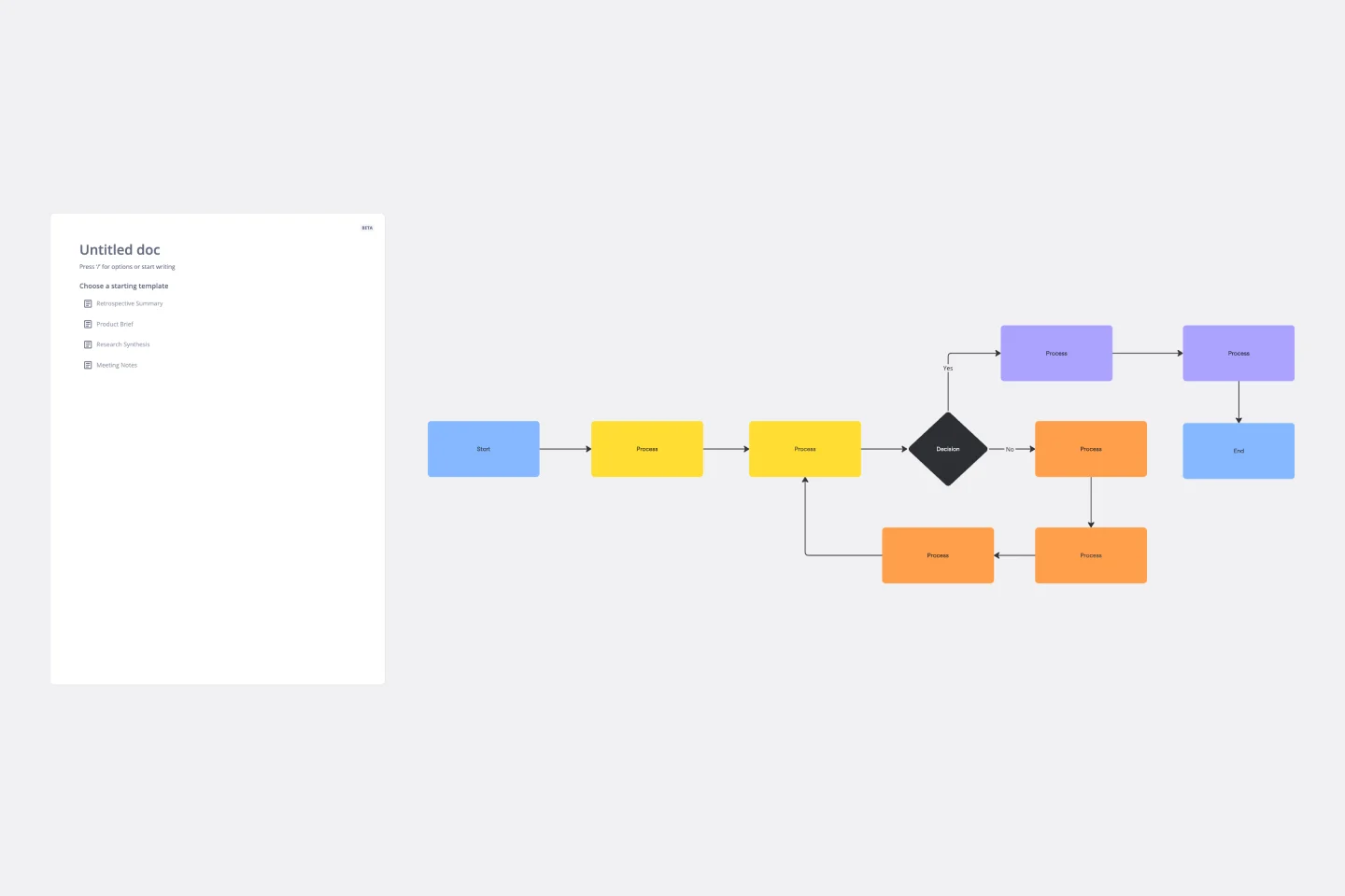
Our yes no chart uses standard shapes such as rectangles, diamonds, and ovals to represent processes, decisions, and endpoints. With arrows connecting each shape, viewers can effortlessly navigate from one step to the next based on their yes or no decisions.
Overall, using our yes no flowchart template is a simple yet powerful way to streamline project planning and execution.
What is a yes no flowchart?
A yes no flowchart, sometimes known as a decision flowchart, is a diagram used to map out a process using a series of yes/no questions to guide decision-making. These flowcharts help users follow a logical path based on binary choices, making it easier to understand and navigate complex processes.
How to use our yes no flowchart template
Miro’s yes or no chart template has been designed to make it easy for both beginners and flowchart whizzes to create efficient and useful flowcharts.
Edit easily: Start by clicking on any shape or text. Change the content to suit your specific process or decision point.
Expand the flow: If your decision-making process is more complex, add more shapes by clicking on the shape's blue dots. The automated diagramming feature ensures connector lines adjust themselves automatically.
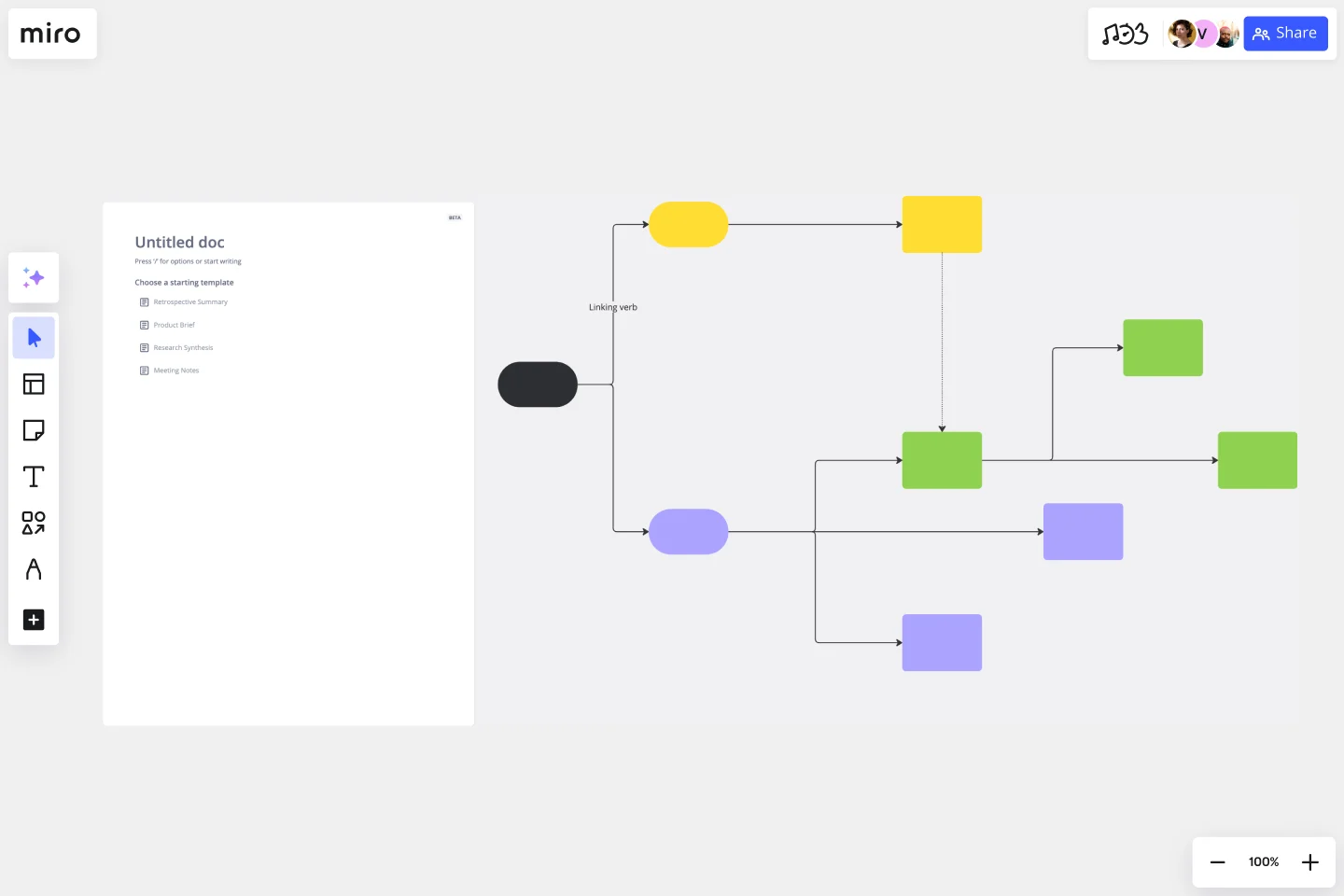
Add context: Enrich your flowchart by dragging any artifact onto your workspace. These can be images, documents, or links that give additional information or clarity about a particular step or decision.
You can also generate a yes no flowchart with Miro AI with the Create with AI Feature.
Why should you use a yes no flowchart template?
There are many reasons why a yes no flowchart template is a good decision for your business. From time saving and enhanced clarity to greater flexibility and error reduction.
Clarity
Flowcharts break down complex processes into simple, visual steps everyone can understand. This promotes clear communication and ensures that everyone knows exactly what needs to be done. With a yes no flowchart template, you can deliver clarity right from the beginning.
Efficiency
Visual representations are faster and more effective in conveying processes than lengthy explanations or written documents. Using a yes or no flowchart template helps teams save time and effort while ensuring that nothing is overlooked.
Flexibility
A yes no flowchart template can be tailored to fit any process or decision-making sequence, regardless of the industry or domain. This means it can be used in various contexts and adapted to suit specific needs.
Collaboration
Flowcharts promote collaboration by allowing team members to work on, comment on, and review the same document simultaneously. This makes it easier to incorporate feedback and ensure everyone is on the same page.
Using a creative yes no flowchart template helps your team to collaborate early on, in a way that is best for them.
Error reduction
By mapping out all possible outcomes in a yes no flowchart in advance, teams can identify potential problems and address them proactively. This helps to reduce the risk of errors, bottlenecks, and other issues that can derail a process.
If you'd prefer to diagram from scratch, Miro's easy-to-use flowchart creator will help you build an online flowchart in no time. With Miro's collaboration features, you can workshop it with your team and easily share it with others for feedback.
Create your yes no flowchart today
Ready to get going? Our yes no flowchart template is ready and waiting for your input.
Yes No Flowchart FAQs
What shapes are commonly used in the yes no flowchart template?
The most commonly used shapes in a yes no flowchart are: - Rectangles - for processes or actions - Diamonds - for decision points - Ovals - for start or endpoints Each shape serves a distinct purpose in the flowchart.
Can I integrate external data or links into the flowchart?
Absolutely! You can drag and drop any external artifact onto a Miro workspace. In our yes no flowchart template, this can include, but is not limited to, images, documents, or web links.
Is the yes no flowchart template adjustable in size and layout?
Yes, our yes no flowchart template is fully customizable. You can adjust the size of shapes, reposition them, or change the flow direction as per your needs.
How do I share or present the completed flowchart to my team?
Once you've tailored the yes no flowchart to your satisfaction, you can present it within the platform or export it in various formats for sharing or printing.
Can I use AI to create a yes no flowchart?
Yes, with Miro AI, you can use AI to create a flowchart in minutes, including in a yes no decision tree format.
Do you have any yes no flowchart examples?
Yes, we’ve created an extensive collection of flowchart examples and templates you can use to create your own flowcharts and workflows.

Miro
Your virtual workspace for innovation
Miro is an innovation workspace designed for teams of every size, everywhere, to dream, design, and build the future together. Our mission? To empower these teams to create the next big thing, powered by AI at every step of the way. Over 90 million users around the world rely on Miro to untangle complex ideas, put customer needs first, and deliver products and services faster. All supported by best-in-class security, compliance, and scalability.
Categories
Similar templates
Production Flowchart Template
Production Flowchart Template
The Production Flowchart Template is a well-crafted tool that clearly represents a production process from start to finish. It breaks down complex procedures into easy-to-understand segments, making it easier for stakeholders to grasp the entire process. One of the key benefits of using this template is that it helps to clarify complex production pathways. By mapping out operations visually, teams can identify potential bottlenecks or inefficiencies, facilitating timely and well-informed decision-making.
Cross Functional Flowchart
Cross Functional Flowchart
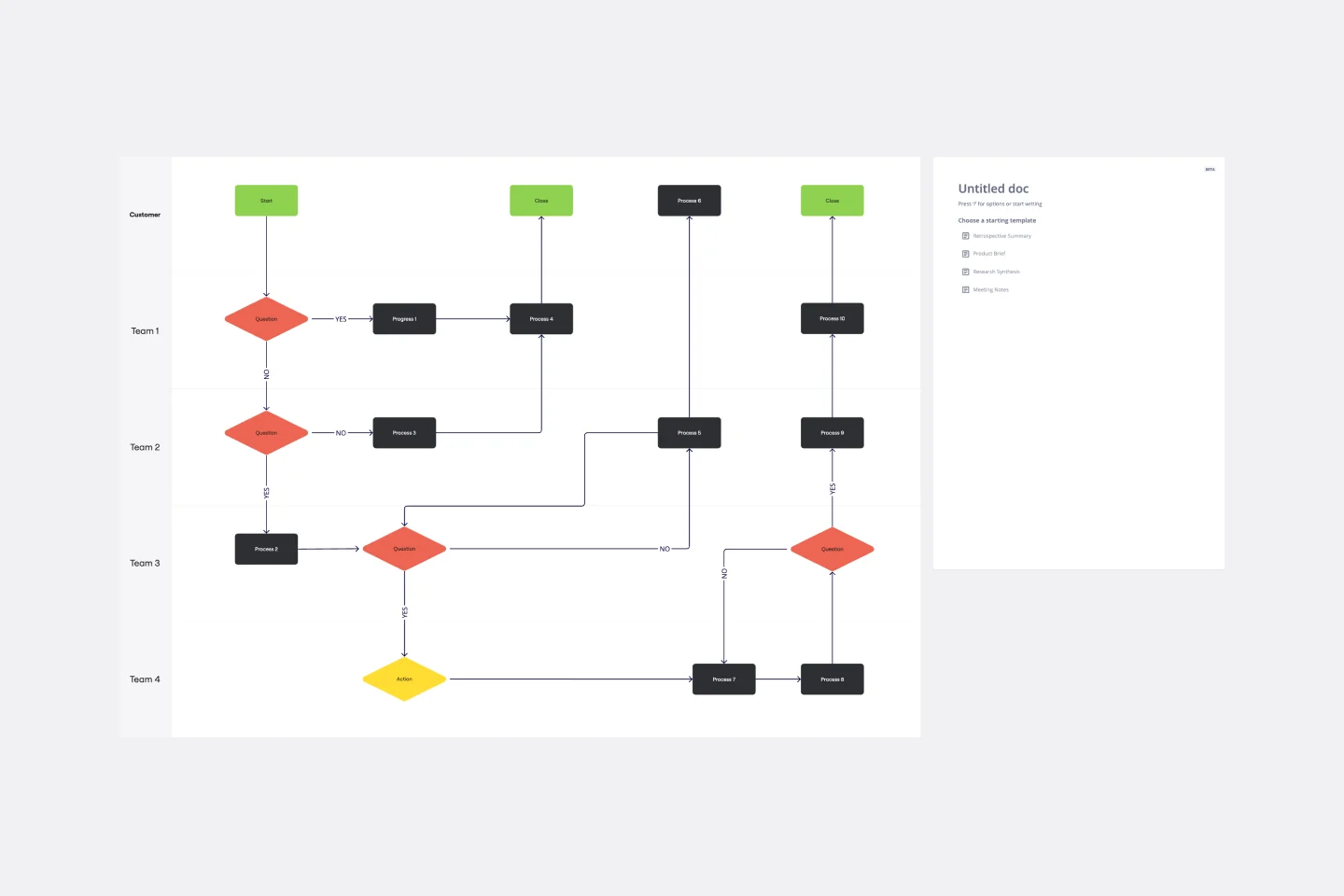
Have a quick look at everyone on a project and see exactly what they’ll contribute. That’s the clarity and transparency a cross-functional flowchart will give you. These are also called “swim lane” flowcharts because each person (each customer, client, or representative from a specific function) is assigned a lane—a clear line—that will help you visualize their roles at each stage of the project. This template will empower you to streamline processes, reduce inefficiencies, and make meaningful cross-functional relationships.
Concept Map Template
Concept Map Template
Use the concept map template to create new ideas, structure your thoughts, and bring your innovations to life. It allows you to explore connections between concepts and let your creativity flow in an organized format. As a result, you’re able to visualize how to bring your new ideas to reality and how various concepts relate to each other.
Flowchart Template
Flowchart Template
Trying to explain a process or workflow to your team — or just wrap your head around it yourself? Sometimes the best way is to see it, and that’s when you create a flowchart. Using common shapes (generally just ovals, rectangles, diamonds, and arrows), a flowchart shows you the direction a process or workflow goes and the order of steps. Beyond giving you a clear understanding, you’ll also be able to see potential flaws and bottlenecks, which helps you refine and improve your process and create a better product more efficiently.
Production Flowchart Template
Production Flowchart Template
The Production Flowchart Template is a well-crafted tool that clearly represents a production process from start to finish. It breaks down complex procedures into easy-to-understand segments, making it easier for stakeholders to grasp the entire process. One of the key benefits of using this template is that it helps to clarify complex production pathways. By mapping out operations visually, teams can identify potential bottlenecks or inefficiencies, facilitating timely and well-informed decision-making.
Cross Functional Flowchart
Cross Functional Flowchart
Have a quick look at everyone on a project and see exactly what they’ll contribute. That’s the clarity and transparency a cross-functional flowchart will give you. These are also called “swim lane” flowcharts because each person (each customer, client, or representative from a specific function) is assigned a lane—a clear line—that will help you visualize their roles at each stage of the project. This template will empower you to streamline processes, reduce inefficiencies, and make meaningful cross-functional relationships.
Concept Map Template
Concept Map Template
Use the concept map template to create new ideas, structure your thoughts, and bring your innovations to life. It allows you to explore connections between concepts and let your creativity flow in an organized format. As a result, you’re able to visualize how to bring your new ideas to reality and how various concepts relate to each other.
Flowchart Template
Flowchart Template
Trying to explain a process or workflow to your team — or just wrap your head around it yourself? Sometimes the best way is to see it, and that’s when you create a flowchart. Using common shapes (generally just ovals, rectangles, diamonds, and arrows), a flowchart shows you the direction a process or workflow goes and the order of steps. Beyond giving you a clear understanding, you’ll also be able to see potential flaws and bottlenecks, which helps you refine and improve your process and create a better product more efficiently.