Website wireframing templates
Miro's website wireframe templates are simple, effective tools to help you arrange the elements of your website. Use the extensive Wireframe Library and create sites that stand out.
5 templates
Website Wireframing Template
7 likes475 uses
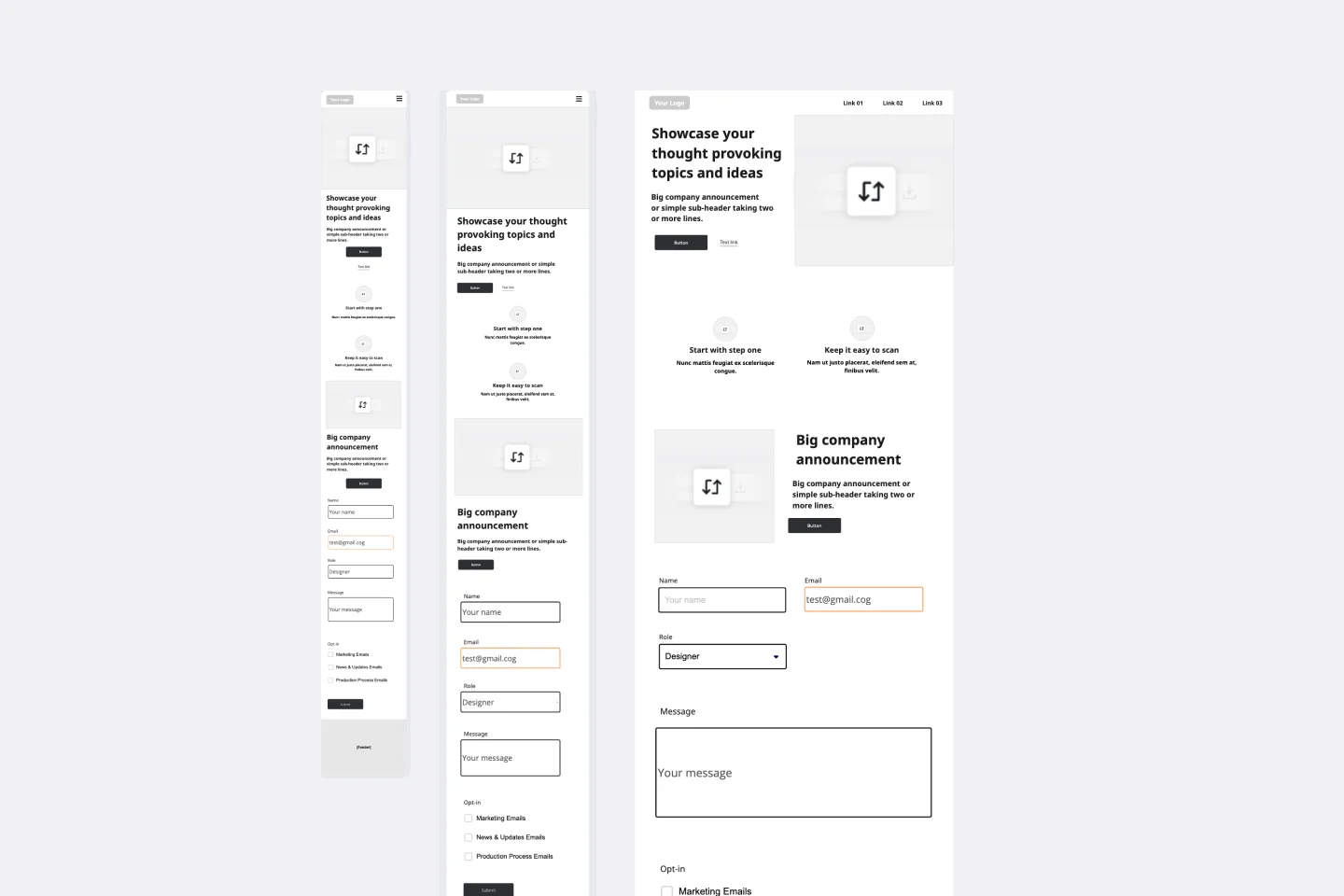
Website Wireframing Template
Wireframing is a method for designing a website at the structural level. A wireframe is a stylized layout of a web page showcasing the interface elements on each page. Use this Wireframe Template to iterate on web pages quickly and cheaply. You can share the wireframe with clients or teammates and collaborate with stakeholders. Wireframes allow teams to get stakeholder buy-in without investing too much time or resources. They help ensure that your website’s structure and flow will meet user needs and expectations.
Website Landing Page Wireframe Template
7 likes223 uses
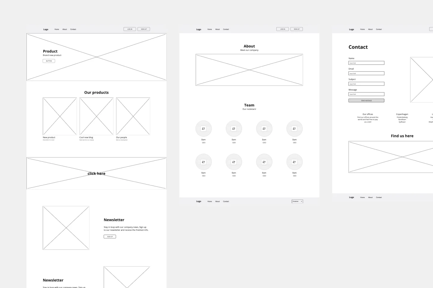
Website Landing Page Wireframe Template
The Website Wireframe template equips you with everything needed to kickstart your next website or web page concept. Rather than starting from scratch, the template offers a ready-to-use, customizable layout for your designs. Change and rearrange the included pages and components to build the perfect wireframe for your project.
Website Prototype Template
4 likes204 usesWebsite Prototype Template
Miro's website prototype template empowers teams to visualize and iterate on website designs collaboratively and efficiently, leveraging the latest AI capabilities for enhanced prototyping and seamless integration with other tools.
Restaurant Website Wireframe Template
1 likes117 uses
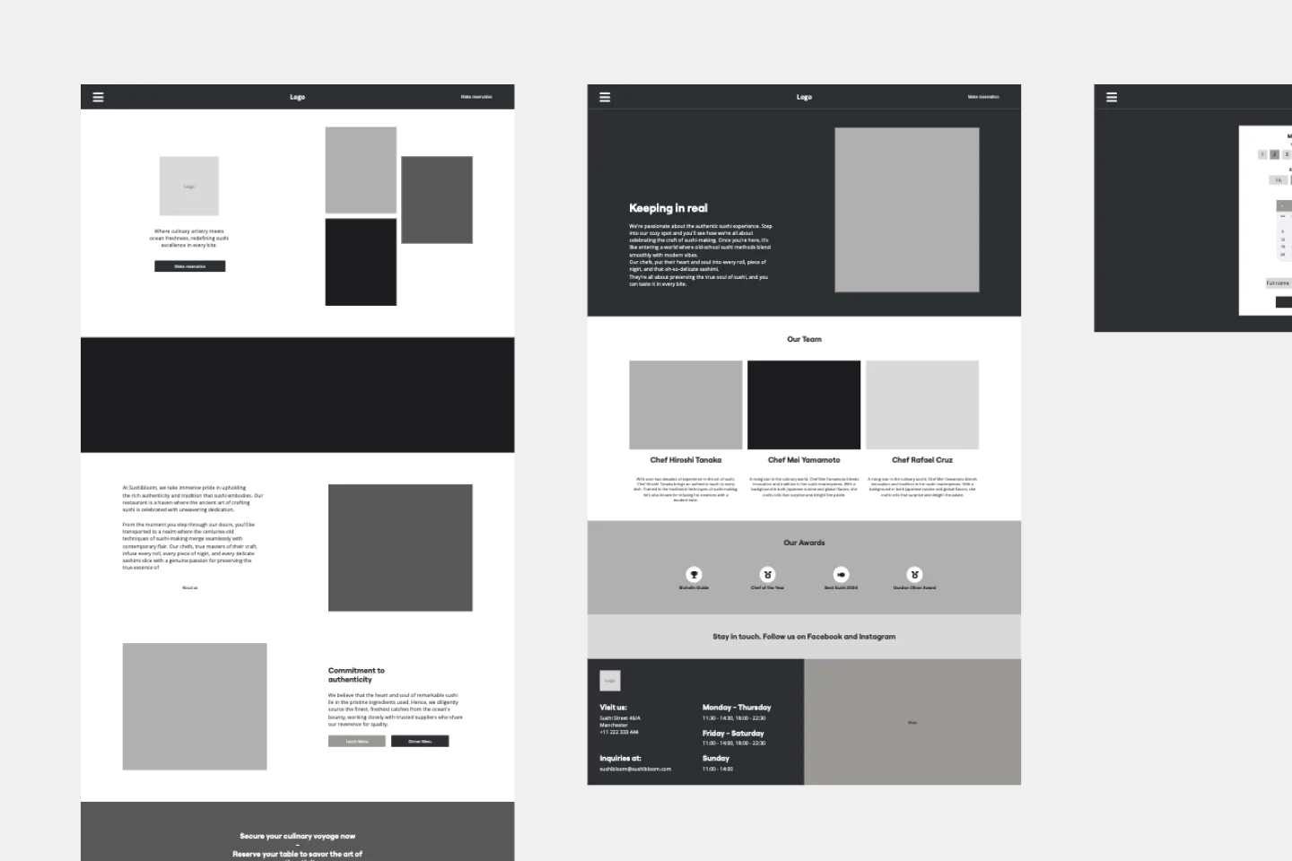
Restaurant Website Wireframe Template
The Restaurant Website Wireframe template is the perfect starting point for your next UI design project. With an intuitive drag-and-drop editor, you can easily customize the template to reflect your brand's unique style or tailor it to meet a client's specific requirements. Add your logo, images, and content to craft a distinctive and engaging website design. Whether showcasing your menu, featuring customer reviews, or sharing your restaurant’s story, this template offers endless design possibilities. Boost your design process with AI tools like text and image generation or quickly create new screens using the Autodesigner screen generator.
Banking Website Wireframe Template
0 likes56 uses
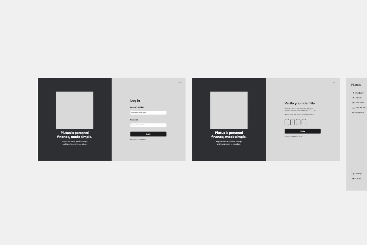
Banking Website Wireframe Template
The Banking Website Wireframe template offers all the essential screens your project might require. Whether you're working on your banking site wireframe alone or collaborating with a large team, this template simplifies teamwork. Easily invite colleagues to your project or share a preview link with external stakeholders for quick approvals.

Explore more
About the Website Wireframe Template
A website wireframe template is a simple, effective tool that helps you arrange the visual elements and framework for each website page, allowing you to create the best version of your prototype. Many UX and product teams use website wireframes to align on the visual design, user flow, and website information architecture.
How to use the website wireframe template
Making your own website wireframe is easy. Miro's visual collaboration platform is the perfect wireframing tool to create and share one. Get started by selecting the website wireframe template, then take the following steps to make one of your own.
Add the website wireframe template to your board.
View the components glossary on the template to get a feel for how to customize for different UI states and styles. Afterward, open the Wireframe Library and choose the elements and icons you want to use.
Drag and drop the elements to your wireframe on the board.
Double-click the wireframe elements to edit and customize them as you see fit.
Request feedback directly on the board by tagging team members in comments.
How to ideate your website wireframe
Here are a few things to consider when creating a website wireframe together with your team:
1. Be clear about your goals
At the beginning of this process, it's vital to define and understand the goals of your website. Before you start wireframing, ask your team these questions:
What do we hope to accomplish by creating this web page?
Do we want more traffic?
Should they purchase something from our website?
Do we want to increase app downloads?
Whatever your goals are, ensure that your entire team is aligned so the process can run more smoothly. Write answers down on sticky notes on your website wireframe template to keep them top of mind.
2. Think about the user experience
When your user interacts with your product, they're taking a journey from one part of the website to the next. This enables everyone on your team to understand how the website visitor will interact with every page. As a UX designer, your goal is to make that journey as effortless and enjoyable as possible. Think about user interactions, not individual screens. Design for flow. Outline every entry point a user may have, and from there, begin your journey flow.
Ask yourself these questions: What is important on this screen? How should the user interact with it?
3. Try to include content early in the process
Using actual content makes deciding whether the intended copy will fit the design easier. In general, actual content generates better feedback, meaning your design will need fewer iterations later in the process. Here you can also determine which hyperlinks, images, or other website elements you would like to add to the page.
Be aware that wireframing is a very iterative process. It is normal to go back and forth and make lots of changes throughout the process. Don't be discouraged by this. Wherever you can, try to simplify your wireframe and allow space to have fewer clicks for your user.
4. Annotate
Communication is key to getting people to understand your thought process. Don't assume that your website wireframes speak for themselves — annotate as you wireframe to make it easier to receive feedback. Receiving feedback prevents getting lost in any miscommunications and will enhance collaboration within your development, design, and internal teams, as well as customers.
Discover more high-fidelity wireframe examples to help you build your next big thing.
FAQ about website wireframes
How do you create a website wireframe?
You can create a website wireframe with our ready-made template and customize it to your needs. When creating a website wireframe, there are four essential steps: set your website wireframe goals, design user flow, iterate and prototype, and test. Set your goals based on your UX and UI research, then design your user flow and add content early on, if possible. Afterward, annotate on your website wireframe to explain your template to your teammates or stakeholders, then prototype, test, and iterate.
What does a wireframe look like?
The website wireframe often contains some design elements as placeholders, so designers at this stage can focus on the layout and page structure rather than the visual aspect of design. Most website wireframes also include a color palette.
When should you make a website wireframe?
It would be best to make the website wireframe early in the design process since it's a cheap and straightforward way to start working on visuals and is easily changeable. The initial website wireframe template is more about the layout itself; designs and content come later in the wireframing process.
Why create a website wireframe?
There are many reasons to create a website wireframe. The key reason would be to help you identify every part of your site’s functionality. It can help you log changes, identify any points of friction, spot potential risks and allow you to collaborate better and more efficiently with your team.
