T-chart templates
Miro's T-chart templates help you compare and organize ideas effortlessly. Whether you're analyzing options, making decisions, or solving problems, these templates provide a clear structure to visualize pros and cons, identify patterns, and clarify choices.
17 templates
T-Chart Template
0 likes20 uses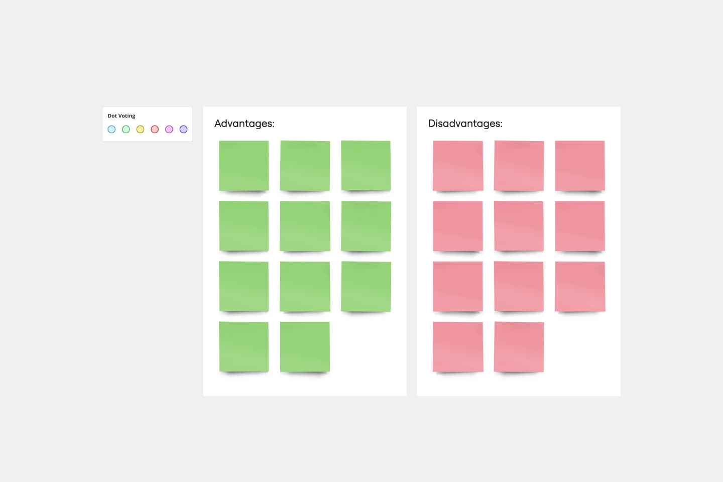
T-Chart Template
T-Charts can help you compare and contrast two different ideas, group information into different categories, and prove a change through “before” and “after” analysis. T-Charts are visual organizational tools that enable you to compare ideas, so you can evaluate pros and cons, facts and opinions, strengths and weaknesses, or big-picture views versus specific details. Designers and content creators can use T-Charts to turn possibilities into actionable ideas. T-Charts are useful for discussing differences and similarities with your team or clients and can help you to reach a decision together.
Alignment Chart Template
0 likes39 uses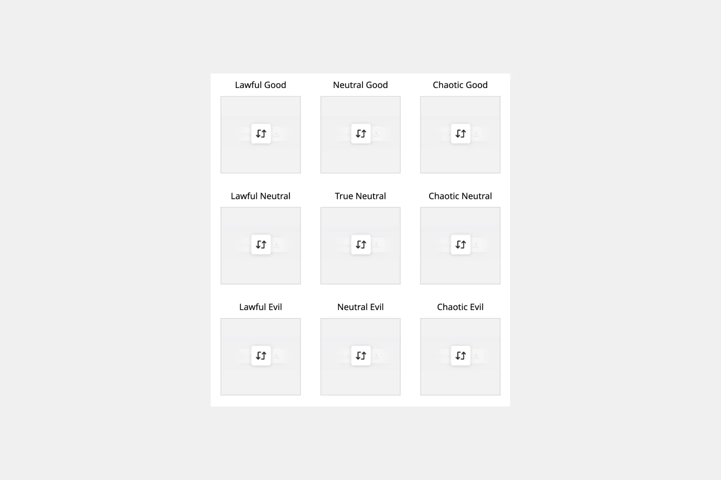
Alignment Chart Template
The alignment chart originated in the Dungeons & Dragons (D&D) fantasy role-playing game to allow players to categorize their characters according to their ethical and moral perspectives. Since then, people around the world have begun to use the alignment chart as a fun way to describe their own characteristics and personas, as well as fictional characters, famous people, and much more. In the conventional set-up, you figure out your placement in the alignment chart based on your views on law, chaoss, good, and evil. But you can adapt the alignment chart to reflect any characteristics you wish to use to create personas.
Pros and Cons List Template
0 likes285 uses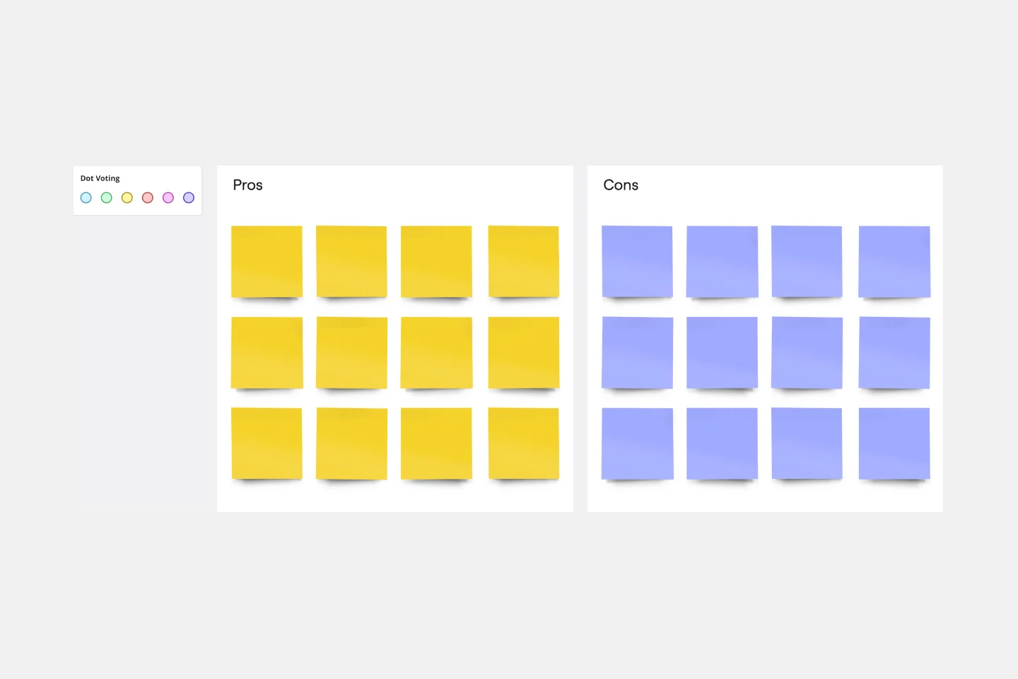
Pros and Cons List Template
A pros and cons list is a simple but powerful decision-making tool used to help understand both sides of an argument. Pros are listed as arguments in favor of making a particular decision or action. Cons are listed arguments against it. By creating a list that details both sides of the argument, it becomes easier to visualize the potential impact of your decision. To make your pros and cons list even more objective, it can help to weight each pro and con against the others. You can then present your decision with confidence, making a strong argument for why it’s the right one.
Gantt Chart Template
9 likes584 uses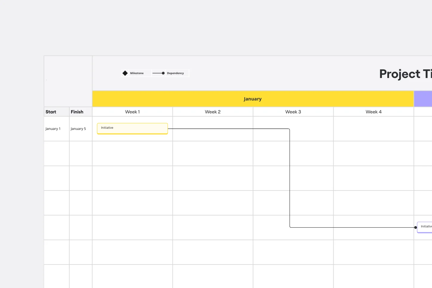
Gantt Chart Template
Simplicity, clarity, and power — that’s what make Gantt charts such a popular choice for organizing and displaying a project plan. Built upon a horizontal bar that represents the project progress over time, these charts break down projects by task, allowing the whole team to see the task status, who it’s assigned to, and how long it will take to complete. Gantt charts are also easily shareable among team members and stakeholders, making them great tools for collaboration.
Advanced Project Gantt Chart Template
162 likes532 uses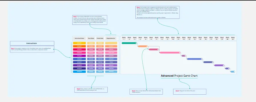
Advanced Project Gantt Chart Template
Manage complex projects with ease using the Advance Project Gantt Chart Template. This tool helps you schedule tasks, set deadlines, and track progress in a visual format. Ensure that all team members are aligned and that your project stays on track. Ideal for project managers handling multifaceted projects with multiple dependencies and timelines.
Gantt Chart for Project Scheduling
35 likes523 uses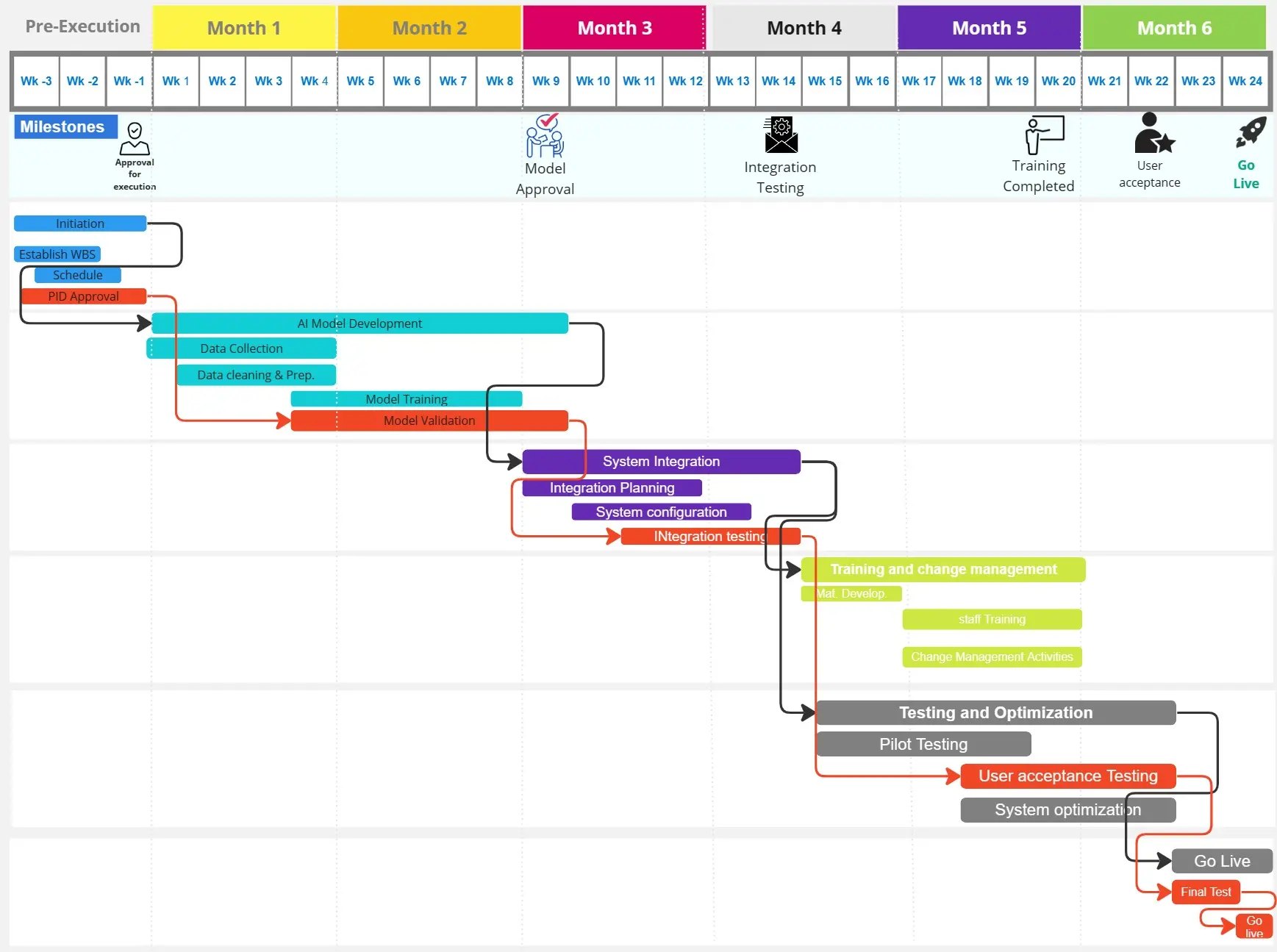
Gantt Chart for Project Scheduling
Gantt Chart for Project Scheduling helps you plan and visualize project timelines. It enables you to manage tasks, deadlines, and dependencies, ensuring efficient project execution. Ideal for project managers looking to streamline their scheduling process.
Gantt Chart Project
47 likes400 uses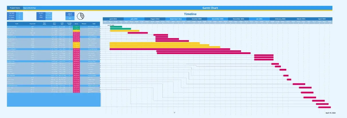
Gantt Chart Project
The Gantt Chart Project template is a versatile tool for managing various types of projects. It provides a clear visual timeline of your project's tasks, deadlines, and dependencies. Use it to plan, execute, and monitor your project's progress, ensuring all activities are aligned and on track. This template enhances team collaboration, improves time management, and helps address potential bottlenecks for successful outcomes.
Agile Project Gantt Chart
60 likes327 uses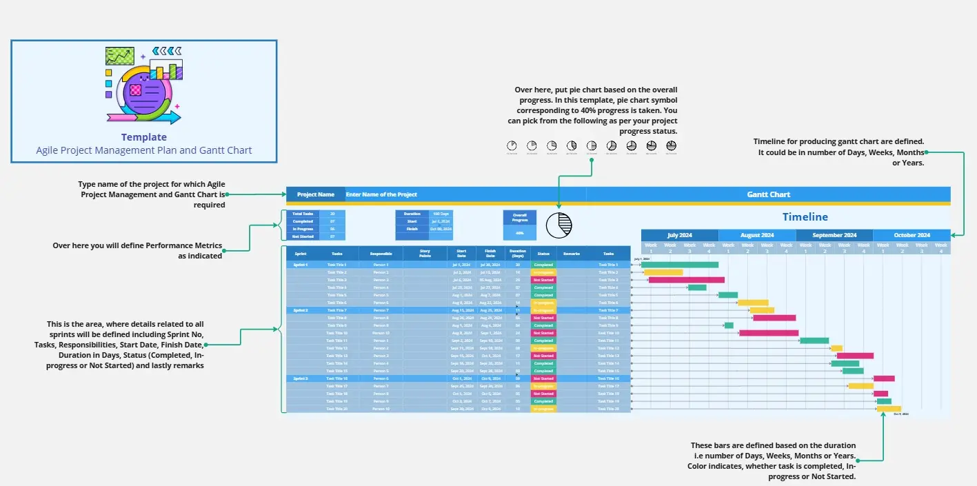
Agile Project Gantt Chart
Streamline your agile projects with the Agile Project Gantt Chart. This template combines the flexibility of agile methodology with the structure of Gantt charts, allowing you to plan sprints, track progress, and adjust timelines dynamically. Perfect for agile teams seeking to enhance their project management efficiency and deliver timely results.
Pros and Cons List Template
0 likes285 uses
Pros and Cons List Template
A pros and cons list is a simple but powerful decision-making tool used to help understand both sides of an argument. Pros are listed as arguments in favor of making a particular decision or action. Cons are listed arguments against it. By creating a list that details both sides of the argument, it becomes easier to visualize the potential impact of your decision. To make your pros and cons list even more objective, it can help to weight each pro and con against the others. You can then present your decision with confidence, making a strong argument for why it’s the right one.
Comparison Chart Template
2 likes224 uses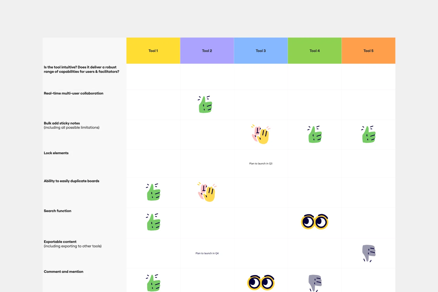
Comparison Chart Template
Eliminate wasted time and learn to make snap decisions both with your team and on your own. Comparison charts are perfect for collaboration, as they allow you to establish differences between ideas or products and get a full picture of the risks and benefits that come with them.
Basic Gantt Chart
11 likes208 uses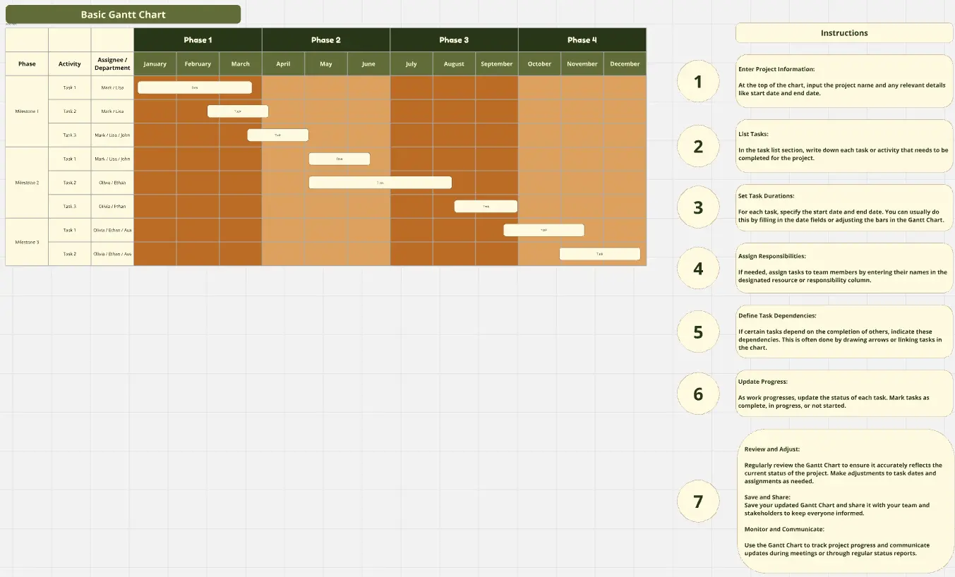
Basic Gantt Chart
The Basic Gantt Chart template is an essential tool for planning, scheduling, and tracking project progress. It provides a clear visual timeline of tasks, dependencies, and milestones, helping teams stay on schedule and manage resources effectively. Ideal for project managers who need a simple, intuitive way to keep everyone aligned and focused on their goals.
Your Project Charter
70 likes198 usesEvent Planning Gantt Chart
14 likes191 uses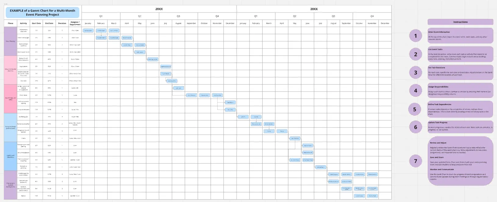
Event Planning Gantt Chart
The Event Planning Gantt Chart template is tailored to organize and manage every aspect of your event. From setting up timelines to assigning tasks and tracking progress, this template ensures nothing is overlooked. Ideal for event planners, it enhances team coordination, improves time management, and provides a clear visual guide to ensure your event runs smoothly and successfully.
Resource Management Gantt Chart
28 likes163 uses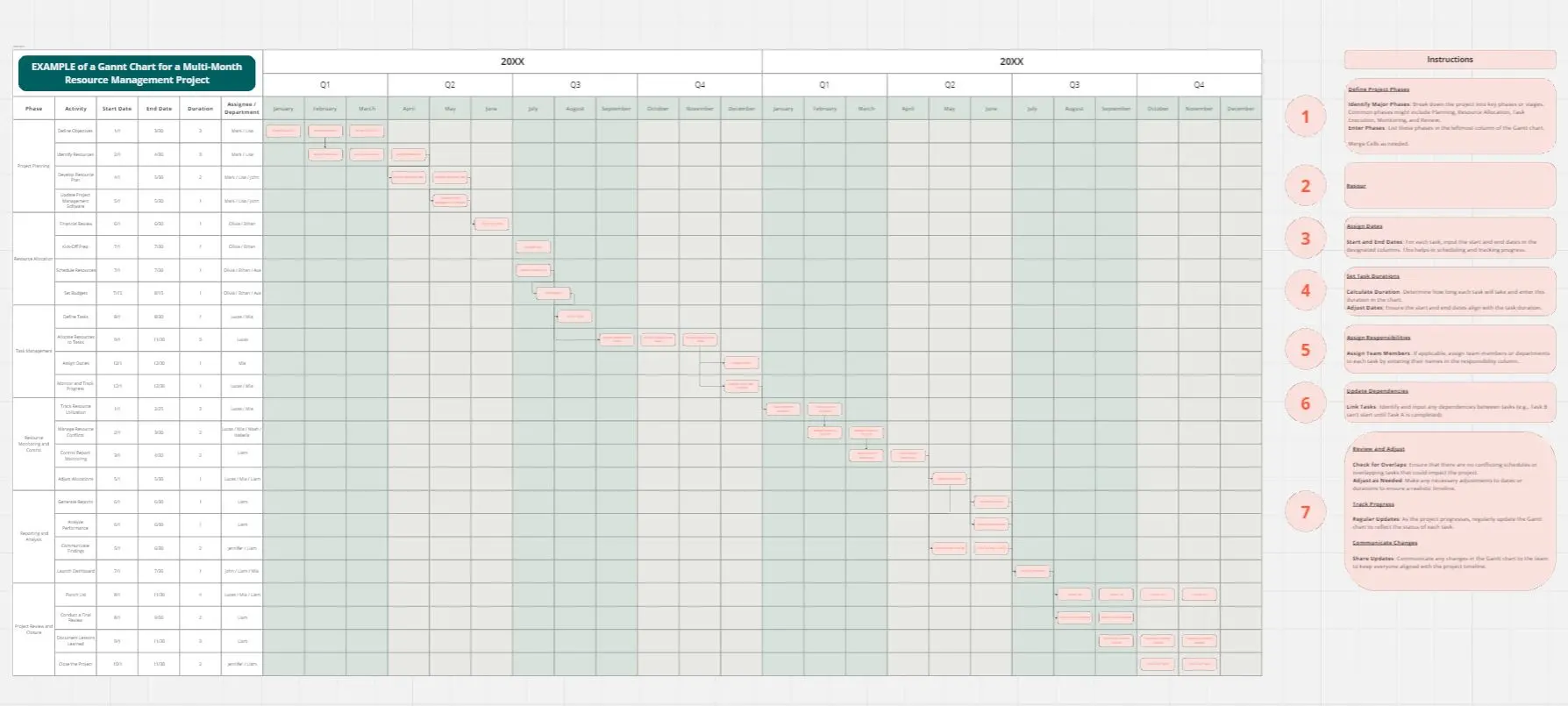
Resource Management Gantt Chart
Efficient resource allocation is crucial for project success. The Resource Management Gantt Chart template helps you plan and manage your resources effectively. Use it to track the availability and allocation of personnel, equipment, and materials throughout your project. This template ensures resources are optimally utilized, reducing waste and avoiding delays, providing a clear overview of assignments and workload balance.
Project Charter Template
2 likes122 uses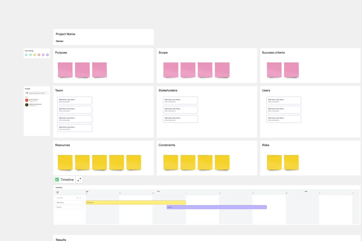
Project Charter Template
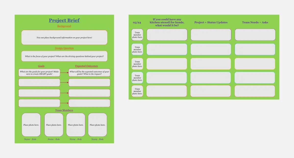
Project managers rely on project charters as a source of truth for the details of a project. Project charters explain the core objectives, scope, team members and more involved in a project. For an organized project management, charters can be useful to align everyone around a shared understanding of the objectives, strategies and deliverables for a project of any scope. This template ensures that you document all aspects of a project so all stakeholders are informed and on the same page. Always know where your project is going, its purpose, and its scope.
Product Development Gantt Chart
7 likes78 uses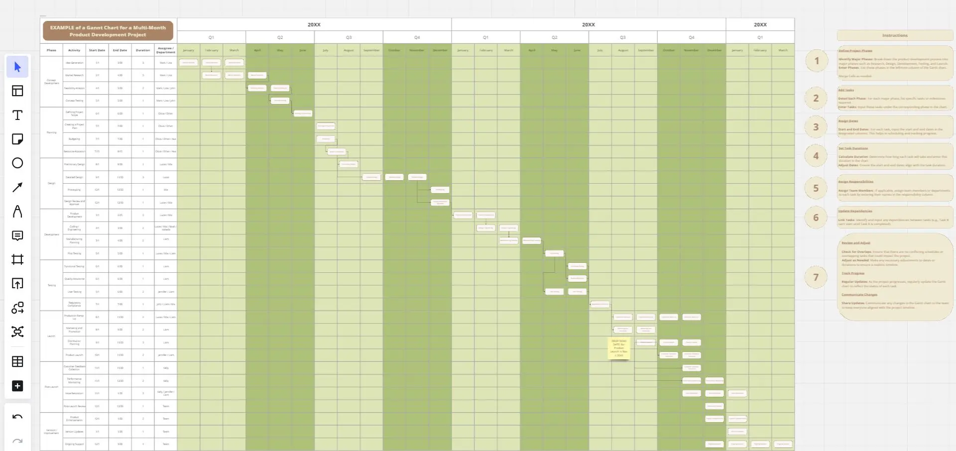
Product Development Gantt Chart
Developing a new product involves many steps and stakeholders. The Product Development Gantt Chart template helps you manage this complex process efficiently. Use it to outline each phase of development, set timelines, and assign responsibilities. Track progress and make adjustments as needed to stay on schedule. This template provides a clear visual representation, coordinating tasks for a successful product launch.
Sales Strategy Gantt Chart
3 likes67 uses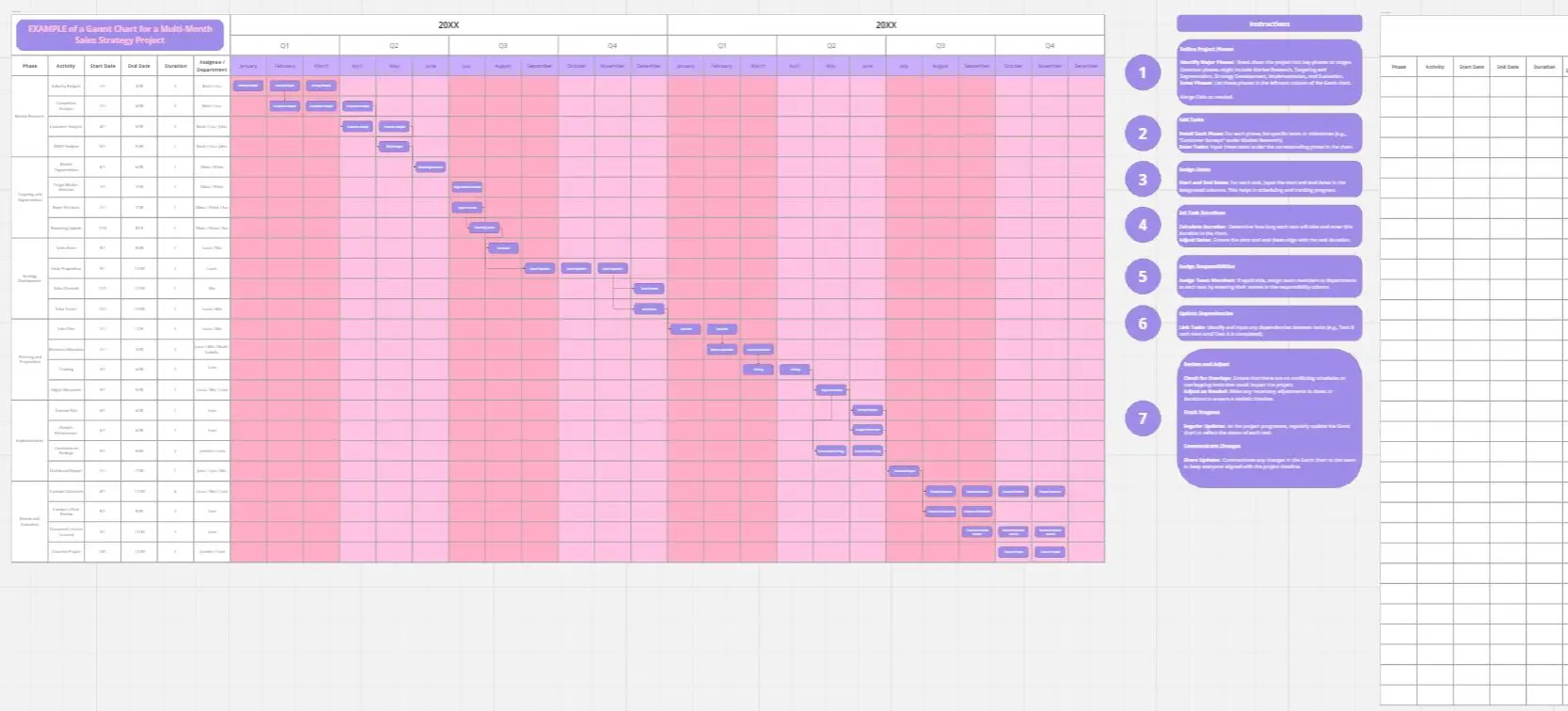
Sales Strategy Gantt Chart
Creating and executing a sales strategy requires meticulous planning. The Sales Strategy Gantt Chart template helps you map out every step of your strategy, from goal setting to implementation and review. Visualize key activities, set timelines, and assign tasks to ensure your sales team stays focused and aligned. This template enables you to track progress, measure performance, and make data-driven adjustments for better sales outcomes.
Alignment Chart Template
0 likes39 uses
Alignment Chart Template
The alignment chart originated in the Dungeons & Dragons (D&D) fantasy role-playing game to allow players to categorize their characters according to their ethical and moral perspectives. Since then, people around the world have begun to use the alignment chart as a fun way to describe their own characteristics and personas, as well as fictional characters, famous people, and much more. In the conventional set-up, you figure out your placement in the alignment chart based on your views on law, chaoss, good, and evil. But you can adapt the alignment chart to reflect any characteristics you wish to use to create personas.
Life & Purpose Radial Assessment Chart
14 likes32 usesT-Chart Template
0 likes20 uses
T-Chart Template
T-Charts can help you compare and contrast two different ideas, group information into different categories, and prove a change through “before” and “after” analysis. T-Charts are visual organizational tools that enable you to compare ideas, so you can evaluate pros and cons, facts and opinions, strengths and weaknesses, or big-picture views versus specific details. Designers and content creators can use T-Charts to turn possibilities into actionable ideas. T-Charts are useful for discussing differences and similarities with your team or clients and can help you to reach a decision together.
Explore more
About the T-Chart Templates Collection
T-chart templates are versatile tools designed to help people organize and compare information effectively. They feature a simple two-column layout, typically used to list pros and cons, advantages and disadvantages, or any other comparative data. Our T-chart templates are fully customizable, allowing users to tailor them to their specific needs by adjusting colors and fonts and adding images or other visual elements. This flexibility makes them suitable for various applications, from decision-making processes to brainstorming sessions.
Why you'll love our t-chart templates
Using T-chart templates in Miro offers many benefits:
Ease of use: T-chart templates are straightforward and intuitive, making it easy for anyone to start organizing their thoughts without a steep learning curve.
Customization: Miro's T-chart templates can be customized to fit your specific needs. You can change the labels, colors, fonts, and even add images or videos to make your T-chart more engaging and relevant to your project.
Collaboration: Miro's platform allows for real-time collaboration, enabling team members to work together on the same T-chart, regardless of their location. This fosters better communication and more efficient decision-making.
Accessibility: Miro's T-chart templates are accessible from any device, whether you're using a desktop or a mobile device. This ensures that you can work on your T-chart anytime, anywhere.
Professional appearance: The pre-designed layout of Miro's T-chart templates helps you create professional-looking charts quickly and easily, saving you time and effort.
How to use the t-chart templates in Miro
Follow these steps to make the most out of Miro's T-chart templates:
Select a template: From the main menu, select "Templates" and choose a T-chart template from Miro's extensive collection.
Add to board: Drag the T-chart template onto a blank board or incorporate it into an existing board you're working on.
Customize: Adjust the template to fit your needs. Change the column labels, colors, fonts, and add any images or videos that are relevant to your comparison.
Input data: Begin adding your data to the T-chart. Use sticky notes to input text, images, or other visual elements into the appropriate columns.
Collaborate: Share the T-chart with your team and collaborate in real-time. Miro's platform allows multiple users to edit and comment on the chart simultaneously.
Export and share: Once your T-chart is complete, you can export it as a PDF or image file, or share a link to the T-chart within Miro for easy access.
By using Miro's T-chart templates, teams can streamline their decision-making processes and enhance their collaborative efforts, ultimately helping them to thrive in their projects and initiatives.
