About the Spaghetti Diagram Template
The Spaghetti Diagram Template can help you visualize the flow of people, materials, documentation, and products in your processes, as well as how these elements interact with each other.
Spaghetti diagrams are also part of LEAN tools, a set of problem-solving methods designed to increase process efficiency. These tools are particularly helpful when reengineering business processes.
This template enhances your understanding of a current process, helping you identify redundancies and spot areas for improvement. You can also use the template to map out a workflow before implementing a process change.
For example, you might use this template to map out a patient's experience at a hospital. You'll also want to include the management hierarchy for staff, emergency protocols, and information about the supplies needed in each department.
This way, employees at all levels of the organization can understand how their work processes fit into the hospital's process flow as a whole and identify areas that need improvement.
Keep reading to learn more about the Spaghetti Diagram template.
What is a spaghetti diagram?
A spaghetti diagram, also known as “spaghetti chart,” “spaghetti plot,” or “spaghetti model,” is a visualization tool used in process mapping to show the flow of information, people, and products.
In a spaghetti diagram, each part of the process flow is represented as a strand. These strands come together at decision points or "intersections" to form a network.
A set of tasks are represented by colorful, semi-transparent strands that connect up to show how they're related in time, space, or agreement with one another.
For instance, let's say you are designing a website and want to plan out the basic page flow. You could represent each web page as one of the noodles in the diagram, and then you could show which pages link to one another (dependencies) with connecting noodles.
Or you could show what pages people visit before they purchase a certain product, what steps are involved in the purchasing process (work sequences), and who they're working with (agreements) during the purchasing process.
In short, a spaghetti plot is a quick and easy way to track distances between parts, people, or work that otherwise would be hard to represent.
Benefits of using a Spaghetti Diagram Template
Some of the benefits of spaghetti diagrams include:
Quickly identify process waste and inefficiencies: Since spaghetti diagrams are simple and easy to read, it's easy to identify problems quickly and improve the quality of a process.
Identify non-value added time: Since the spaghetti diagram freezes work-in-progress for a particular time slice, you can see how much time is actually spent doing standard work versus how much time is wasted organizing tasks or attending.
Keep everyone on the same page: This diagram can be helpful when you want to visually track work that needs to be done between different departments or stakeholders and make sure everyone’s on the same page.
Track the working schedule of people and machines: When there are multiple work areas or production lines, a spaghetti diagram can help you track everyone’s and everything’s working schedule.
Maximize productivity: Since spaghetti diagrams (can) provide a quick way to see and understand the big picture, you can make sure everyone is working on things that are most important.
Create your own spaghetti diagram
With Miro, you can create your own spaghetti diagram in minutes. Get started by opening our Spaghetti Diagram Template.
This template comes pre-loaded with sticky notes and connector lines.
Step 1: Start by adding your first noodle or set of tasks. Begin to build the spaghetti diagram by adding other noodles.
Step 2: Drag and drop noodles to connect them to each other, or move noodles by dragging them around on the canvas. The connector lines will adjust automatically to maintain the connection.
Step 3: Add a sticky note by double-clicking on a noodle and typing in the text of your choice. You can also move the note by dragging it around on the canvas.
Step 4: When you're done, simply save your spaghetti diagram and share it with any relevant team members.
With Miro, collaborating with team members is pretty straightforward. You can invite your team to collaborate on a specific template and edit your data in real-time.
Example of a spaghetti diagram in action
Let’s imagine that you’re the owner of a car manufacturing company and want to improve your stamping process. Let’s also imagine that your stamping process has four steps:
Find the type of metal the part should be made from
Punch out the corresponding shapes
Stamp or punch out additional shapes
Clean up the final product
To manage this process, you create a spaghetti diagram with four noodles labeled ‘1’ through ‘4’. You then create four labels on each noodle that say ‘Metal Type,’ ‘Punch Shapes,’ ‘Stamp Shapes,’ and ‘Cleanup.’
You then color code each label with the same color as the noodle it’s on and finish by drawing connection lines between each step.
This allows you to visualize your entire stamping process and understand how the different steps connect.
Spaghetti diagram FAQ
What is a spaghetti diagram used for?
A spaghetti diagram is usually used to illustrate a process or set of processes. It shows the various stages and interactions between each stage, allowing the reader to visualize how things are connected. This helps you see both the big picture and all of its individual components.
What is a spaghetti diagram in Six Sigma?
In lean manufacturing, a spaghetti model is a form of process mapping that’s used to identify opportunities for improvement. They’re usually used to show how transactions flow through an organization, including the steps involved and the possible choke points.
How do you use spaghetti diagrams?
In our Spaghetti Diagram Template, the stages of a process are shown in a different color. Interactions between stages are marked with arrows (or lines) formatted to show which stage they connect to. The thickness of the arrows is proportional to the frequency of interactions, which allows for easy comparison.
Why use a spaghetti diagram?
Spaghetti diagrams illustrate the big picture of a process, which is useful for identifying areas where you might need more data or optimization. A spaghetti diagram allows you to see the process as a whole, making it easier to identify opportunities for improvement.

Miro
Your virtual workspace for innovation
Miro is an innovation workspace designed for teams of every size, everywhere, to dream, design, and build the future together. Our mission? To empower these teams to create the next big thing, powered by AI at every step of the way. Over 90 million users around the world rely on Miro to untangle complex ideas, put customer needs first, and deliver products and services faster. All supported by best-in-class security, compliance, and scalability.
Categories
Similar templates
Affinity Diagram Template
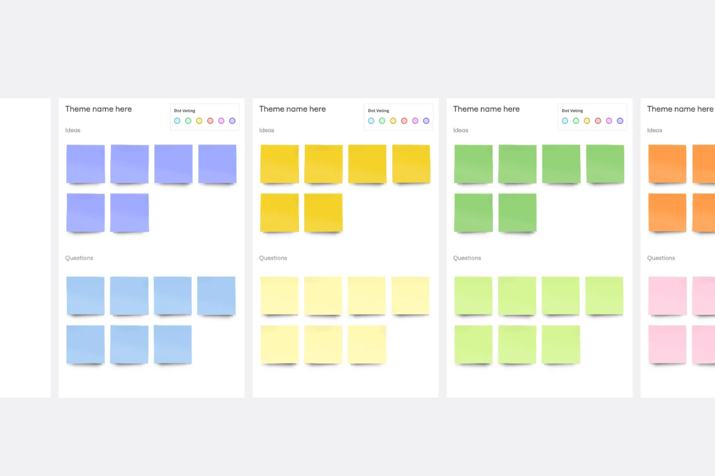
Affinity Diagram Template
You can use an affinity diagram to generate, organize, and consolidate information that comes out of a brainstorming session. Whether you’re building a product, working through a complex problem, establishing a process, or piecing apart an issue, an affinity diagram is a useful and simple framework that gives each team member the opportunity to pitch in and share their thoughts. But it’s not just ideal for brainstorms—this is a great template and tool when you need to reach consensus or analyze data such as survey results.
Bull's Eye Diagram Template
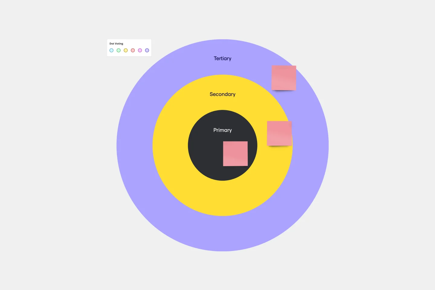
Bull's Eye Diagram Template
When you’re a growing organization, every decision can feel like it has make-or-break consequences—which can lead to decision paralysis, an inability to prioritize, inefficient meetings, and even low morale. If that sounds like you, put a Bull’s Eye Diagram to work. True to its name, a Bull’s Eye Diagram uses a model of concentric circles to help companies establish priorities, make critical decisions, or discuss how to remove or overcome obstacles.
Cisco Data Network Diagram Template
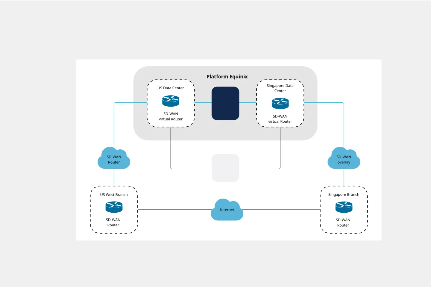
Cisco Data Network Diagram Template
Cisco offers data center and access networking solutions built for scale with industry-leading automation, programmability, and real-time visibility. The Cisco Data Network Diagram uses Cisco elements to show the network design of Cisco Data Networks visually.
Affinity Diagram Template
Affinity Diagram Template
You can use an affinity diagram to generate, organize, and consolidate information that comes out of a brainstorming session. Whether you’re building a product, working through a complex problem, establishing a process, or piecing apart an issue, an affinity diagram is a useful and simple framework that gives each team member the opportunity to pitch in and share their thoughts. But it’s not just ideal for brainstorms—this is a great template and tool when you need to reach consensus or analyze data such as survey results.
Bull's Eye Diagram Template
Bull's Eye Diagram Template
When you’re a growing organization, every decision can feel like it has make-or-break consequences—which can lead to decision paralysis, an inability to prioritize, inefficient meetings, and even low morale. If that sounds like you, put a Bull’s Eye Diagram to work. True to its name, a Bull’s Eye Diagram uses a model of concentric circles to help companies establish priorities, make critical decisions, or discuss how to remove or overcome obstacles.
Cisco Data Network Diagram Template
Cisco Data Network Diagram Template
Cisco offers data center and access networking solutions built for scale with industry-leading automation, programmability, and real-time visibility. The Cisco Data Network Diagram uses Cisco elements to show the network design of Cisco Data Networks visually.