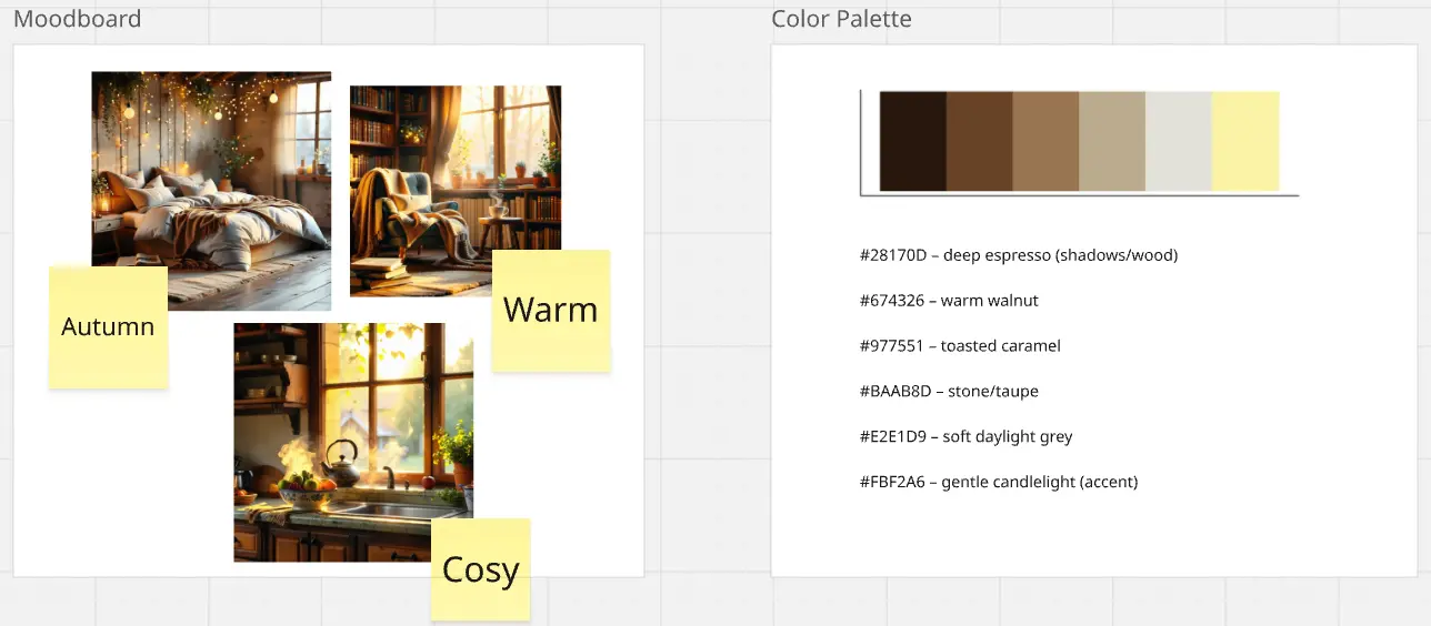
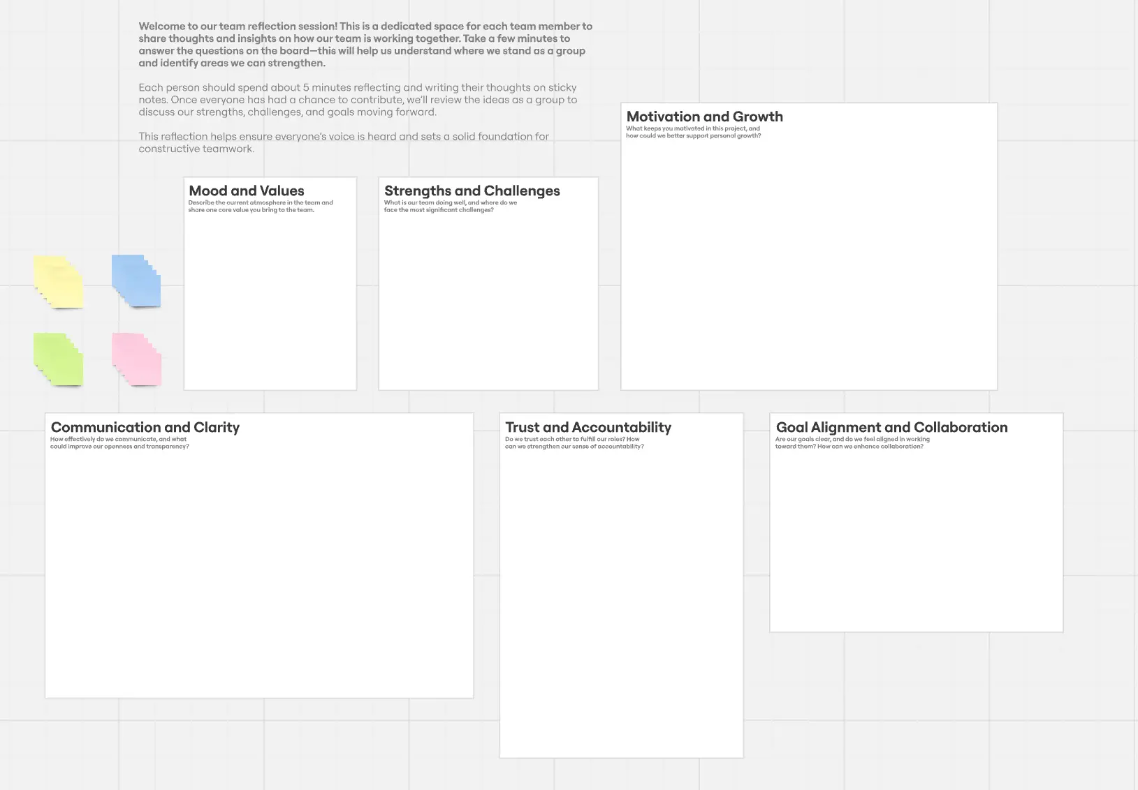
Mood Board Template
Make beautiful authentic mood boards with our mood board template. Collect feedback, riff on ideas, and exchange insights anytime, anywhere. Gather inspiration, evoke emotions, and visualize your brand.
About the Mood Board Template
Describing something as abstract as a feeling can be difficult. But when you’re trying to kickstart a creative project, that’s often the first thing you need to do. Mood boards allow you to gather inspiration, articulate a feeling or mood, and pitch ideas.
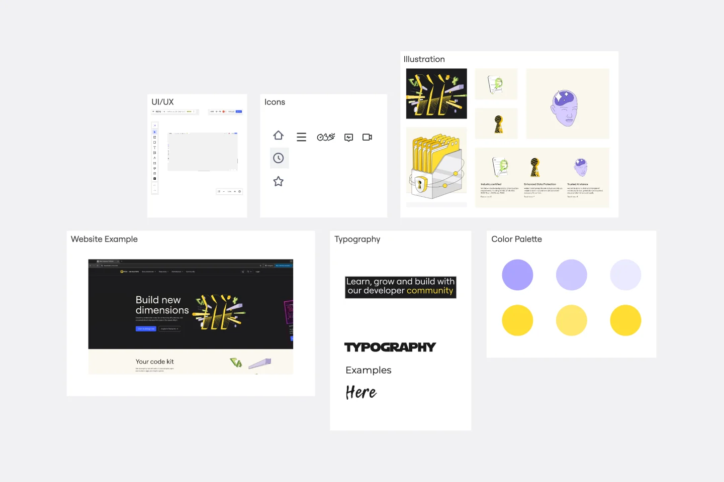
A mood board typically consists of images, color palettes, and typography — basically a canvas or collage where you can add and remove as much as you want. Miro is the perfect mood board creator because it allows you to add as many files as you need in one infinite canvas.
How to use Miro’s mood board template
With Miro, you can select our ready-made mood board template and edit where you see fit, or you can create your mood board from scratch. Here is how to get started:
1. Select the mood board template
In the left toolbar, browse through the Templates Library and select the mood board template. Add it to your workspace.
2. Easily add files
Add any file to your mood board by either uploading from your device or via a URL. You can also add files from other cloud services such as Google Drive and Dropbox, and many more.
3. Make it dynamic
Get inspiration from all mediums, including videos, GIFs, and memes. Miro lets you embed video and other media files by simply copying and pasting the video link.
4. Add clickable screenshots
Use Miro Web Clipper to easily capture web page screenshots and add them to your mood board.
5. Style it and more
Miro’s mood board template is highly customizable. On the side toolbar, use the Pen tool, Shapes, IconFinder, and many other features to add style and edits to your mood board.
6. Collaborate
Invite others to collaborate and create your mood board with you. Or, share it as an image or PDF to post on social media or other websites.
Tips on using the mood board template
Mood boards are an excellent source of inspiration and creativity. Unlock a whole new world of creative possibilities through images, video, and input from team members, no matter where they are.
Use the mood board template to add the visual and content references for projects involving:
UI/UX: Show how people interact with your service or product, and add the look and feel of your interface. How’s the consumer journey, and what does it look like?
Icons: Make an icon people will remember. Think about the most prominent brands and how people identify them quickly by seeing their icons. What’s your brand icon? How can people visually identify your brand?
Illustrations: Shape the look and feel of your brand. What are the feelings you want to evoke with your website, shop, or service?
Website example: Attach any website you find inspiring on your mood board template. How do you want your website to look and be structured?
Typography: Show how people will read your content. How is your brand’s communication design?
Color palette: Colors can be very subtle, but they have a profound impact on how we perceive things. What feelings do you want your brand to evoke through color?
The mood board creation process
Mood boards are often about picturing a concept. The mood board should contain elements that will show the look and feel of your idea. Add images, files, and any other material or content that helps you deliver your vision and pitch your project.
1. Lay out your goals
Inspiration comes from within. Think about what exactly you are trying to put into the board. Mood boards can be both literal and practical. Are you looking to get inspired? Design a product? Let the creative juices flow. Use this opportunity to explore different moods, thoughts, and tones. Explore different color schemes and fonts either together or one by one.
Once you have chosen your direction, name your mood board template. Then add some stickies or images and jot down some ideas before you embark on your mood board creation journey.
Pro Tip: Remember that a mood board is all about creativity and exploration. Don’t lock yourself in just one direction. This might limit or constrain some of your creativity. Start off with a keyword or theme. Or even color or style and use that as a starting point. Have an open mind on what the end result may be.
2. Explore a direction
Now that you've established the direction for your mood board add any written content you have. This might include brand values, positioning statements, taglines, or any other parts of the brief that will inspire you and keep you on track.
Next, add any logos or existing expressions of the brand, like websites, design elements, or photography. These might not make it into the final mood board, but they're still a great place to start. Don’t limit yourself – remember, mood boards are all about inspiration!
3. Unlock creativity with Miro
Miro has a wide range of tools to unlock creativity. Too much static, bland text? Shorten the copy and change up the font. Explore different fonts, colors, and imagery with the help of our advanced technology.
We’ve done the heavy technical lifting, so you can focus on your message and style. Establish a theme for your designs using photos, icons, logos, personalized fonts, and other customizable elements to make them feel entirely authentic.
4. Add visual elements
Add any visual elements to the frame: colors, logos, images, and so on. You can drag images directly into the board or upload them from your device. The visual elements you choose to add are key to the look and feel of your project. They can help define the tone, lighting, and color scheme of your board.
If you would even like to take a little step even further. You can even embed media onto your board using the iFrame Embed widget. That way, you can add videos from YouTube to add a little more depth to the look and feel of your board.
5. Explain your thought process
Once your visuals are ready, take some time to add a few lines of text to explain why you included those particular images.
This step is vital if you are planning on sharing your mood board with another client or team. This helps them understand your thought process in words so they can clearly follow your steps and vision. This will ensure that your ideas and thoughts are kept and understood in the right context. This process does not have to be too long. It can be done in just a quick sticky note or even using one of our emojis.
6. Collaborate on one board
You don’t need to seek inspiration alone. Miro is a collaboration platform that allows you to work together as a team to design, create and put visions onto a board. It is useful to collaborate and come together as a team to bounce ideas off each other. All you need to do is invite them to the board, and then they can access your board from any device and in real time.
7. Gather feedback
Like all creative projects, it is important to be open to constructive criticism in order to improve.
Once your first version of your mood board is ready to go. Add team members to the board to ask for feedback. Here, members can add comments using the comment function as well as jot down suggestions or ideas on sticky notes. Remember to take these suggestions with an open mind, and do not take it personally. What might work for you might not work for them, and vice versa.
8. And you’re done!
Happy with the result? Download and save your design as an image or PDF, or copy the link and share it with your colleagues. Miro makes it easy to download your boards in different formats or export them to many other third-party apps.
Just remember to remain open to inspiration wherever you are. Inspiration can come at any time or any place. Mood boards are creative, and the process is very non-linear. Therefore, you may be going back and forth in steps, but that does not mean you are moving backward.
What are mood boards best used for?
People use mood boards to show a concept, idea, or project visually. They are usually a great source of inspiration and a document where you can always go back to and consult any time you want to know more about the brand and how it looks and feels.
What does a mood board look like?
A mood board is a visual board consisting of a wide array of graphics, photos, text and illustrations. It is a visual way to express your thoughts and ideas through imagery.
What should a mood board include?
Most mood boards often include: - images from your brand, personal collection or stock images - logos and icons - drawings, sketches and illustrations - color swatches and backgrounds - stylized font and text - fabric and paint and textures that suit the overall design.
How to choose photos for mood board?
While choosing photos for mood boards, you can add dimension to your design by selecting images with a variety of depths such as wide full-room shots and close-up shots. Some designers recommend a formula of two interior shots, one product shot, two landscape shots and two texture shots.
How many pictures should a mood board have?
There is no exact answer to how many pictures a mood board should have, but it’s generally recommended to include images that accurately represent the desired style, aesthetic, and mood. When selecting pictures for your mood board, just ensure consistency in terms of color, style, and texture. This helps to create a cohesive and visually appealing mood board that accurately represents the desired theme or concept. And don’t forget: taking the time to carefully curate and organize the pictures will ultimately result in a more effective and impactful mood board.
Get started with this template right now.
Four-Circle Venn Diagram
Works best for:
Venn Diagram
The Four Circle Venn Diagram template is designed for comparing four sets of data. Use this tool to identify commonalities and differences across multiple categories. This template is ideal for complex data analysis, strategic planning, and academic research. It helps you visually organize information, making it easier to understand and communicate insights. Perfect for educators, researchers, and professionals in need of detailed comparison tools.
Epic & Feature Roadmap Planning
Epic & Feature Roadmap Planning template facilitates the breakdown of large-scale initiatives into manageable features and tasks. It helps teams prioritize development efforts based on business impact and strategic objectives. By visualizing the relationship between epics and features, teams can effectively plan releases and ensure alignment with overall project goals and timelines.
BPM
Works best for:
Diagramming
The BPM (Business Process Management) template is a visual tool for modeling, analyzing, and optimizing business processes. It provides a structured framework for documenting process flows, identifying bottlenecks, and improving efficiency. This template enables organizations to streamline operations, enhance productivity, and drive business performance. By promoting process transparency and agility, the BPM template empowers teams to achieve operational excellence and deliver value to stakeholders.
App Wireframe Template
Works best for:
UX Design, Wireframes
Ready to start building an app? Don’t just imagine how it will function and how users will interact with it—let a wireframe show you. Wireframing is a technique for creating a basic layout of each screen. When you wireframe, ideally early in the process, you’ll gain an understanding of what each screen will accomplish and get buy-in from important stakeholders—all before adding the design and content, which will save you time and money. And by thinking of things in terms of a user’s journey, you’ll deliver a more compelling, successful experience.
Empathy Map by Medicenjuande
Works best for:
Market Research, Research & Design
Empathy Map template provides a clear way to visualize user insights. By understanding what users think, feel, and experience, you can design products that truly resonate. This template is perfect for UX teams focused on user-centered design.
Lean UX Canvas Template
Works best for:
Desk Research, Product Management, User Experience
What are you building, why are building it, and who are you building it for? Those are the big pictures questions that guide great companies and teams toward success — and Lean UX helps you find the answers. Especially helpful during project research, design, and planning, this tool lets you quickly make product improvements and solve business problems, leading to a more customer-centric product. This template will let you create a Lean UX canvas structured around eight key elements: Business problem, Business outcome, Users and customers, User benefits, Solution ideas, Hypothesis, Assumptions, Experimentation.