About the Infographic Template
Every day, we’re surrounded and inundated by data. Whether you’re part of a business, a nonprofit, or an organization, you might find it difficult to get your readers, customers, and prospects interested in more data. How can you persuade them to pay attention to dry facts and statistics?
An infographic could be just what you need.
What is an infographic?
An infographic is a visual tool for communicating information. They allow you to turn quantitative or qualitative data into stories that resonate. Use them to give an overview of research findings, showcase survey data, raise awareness of an issue, summarize a topic, and much more.
Most infographics use some combination of text and visuals to break down a complicated topic. For example, you could create an infographic to visualize the customer journey. It’ll have text and images throughout the graphic, allowing the reader to easily digest the information. The best ones are creative and visually striking, catching the reader’s eye so that they’re eager to learn more.
In general, infographics don’t contain much text. Instead, they employ various infographic elements such as images, charts, and graphics to help the audience understand a topic. Graphic designers use infographics to help tell complex stories in a more accessible way than if described by words alone.
What is an infographic template?
When you have a lot of information, it’s hard to figure out how to present it. You want it to be easy to follow and engaging, but you don’t want to miss out on the essential figures and statistics.
With our infographic template, you can create striking visuals for your audience that present data in a digestible way. You’ll be able to reduce complex ideas into a simple and engaging infographic using text, images, and charts. The infographic template has a lot of customization options, so you can create an infographic that’s on brand and structured exactly how you want.
Create an infographic with Miro
Making an infographic is easy with Miro. It’s the perfect canvas to create and share infographics with your team and external parties. And don't worry, you don’t need any design skills to create a high-quality infographic. Start by selecting this infographic template, then take the following steps to create your own.
1. Determine your key takeaways. Teams create infographics to distill a lot of quantitative or qualitative information, like survey data or industry stats. But readers who are exposed to too much data at once tend to miss the point. What do you want your audience to get out of the infographic? Take some time to decide on three to five main points that you’d like your audience to remember to make sure your infographic has clear takeaways that are easy to remember.
2. Decide on the story you want to tell. While your key takeaways are important, they’re not the full story. The goal of an infographic is to guide your reader through a narrative, connecting the dots from your data to your thesis. Weave your three to five main points into a narrative to get your point across and create a memorable infographic.
3. Draft the copy. Once you’ve decided on a narrative, it’s time to write the text that will support your visuals. The text should support the visuals to develop the story of your stats. Keep it short and concise to avoid overwhelming the reader with too much text.
4. Design the infographic. Now it’s time to use the ready-made template for your infographic design. The template makes it easy to create an infographic, even if you’re not working with a design team or you don’t have any design experience. Simply choose your design elements, pick your color scheme, update the text, and select the design icons to make your own version.
5. Revise and iterate. As you work on the text, you’ll have a better idea of what you want the infographic to look like. And as you design the images and charts, you’ll have further opportunities to sharpen and refine your text. Keep iterating until you’ve got a clear, cohesive story in a stunning infographic.
When to use infographics
Infographics are highly adaptable for any organization. But when exactly should you think about using them?
Here are a few common examples:
To summarize a complex topic. Infographics present complex topics and datasets in an accessible way. For example, a sales manager could use an infographic to present sales stats to their team in an engaging format. It makes the stats easy to understand and helps the sales team wrap their heads around what it means for their day-to-day work.
To make information visual. Some information works better in a visual format. For instance, a lot of marketing teams use infographics to liven up survey data or present quantitative information in ad campaigns.
To help customers or clients. Businesses can use infographics to present information to customers or clients. An example might be a “why work with us” infographic. The visual will outline the key USPs of working with the business in a visual and engaging format. An infographic like this will usually sit within a blog post on a company website and in social media posts.
To raise awareness. Infographics are eye-catching, which is great if you want to raise awareness about a certain topic. For example, nonprofits could use infographics to raise awareness about complicated or systemic issues.
Infographic Template FAQs
Where can I get free infographic templates?
There are a lot of platforms that offer free infographic design templates — including Miro. Our online whiteboard is free to use and fully customizable. In addition to our free infographic template, you’ll also get access to a variety of templates and collaborative features. You can host workshops and brainstorming sessions and even plan your next strategy.
What is an infographic for?
An infographic is used to present data visually in a simple, clear and concise way. It combines images, graphics, icons and even diagrams that facilitate understanding and with a simple glance, the reader can understand and assimilate what is being presented.
What are the elements of an infographic?
As a general rule, an infographic should have at least the following elements: title, images, text, sources, and branding. Ideally, the title and text should be brief and straightforward, and images should support your written content. Remember always to mention your data source once infographics are all about visually displaying data. At last, your infographic should reflect your brand, so everyone knows you created it.
Why should I use infographic templates?
Using templates for infographics will help you make them faster because you don't have to design them from scratch. Anyone without any design knowledge can create one because you just have to modify the data as needed and in Miro you can do it in a very intuitive and effective way.

Miro
Your virtual workspace for innovation
Miro is an innovation workspace designed for teams of every size, everywhere, to dream, design, and build the future together. Our mission? To empower these teams to create the next big thing, powered by AI at every step of the way. Over 90 million users around the world rely on Miro to untangle complex ideas, put customer needs first, and deliver products and services faster. All supported by best-in-class security, compliance, and scalability.
Categories
Similar templates
Pie Chart Template
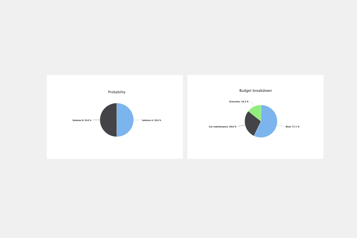
Pie Chart Template
Pie charts are an excellent way to present relationships between datasets graphically, where you can quickly compare information and see contrast right away. Professionals from many fields use pie charts to support their presentations and enrich their storytelling as it’s one of the most commonly used data charts.
Project Proposal Template
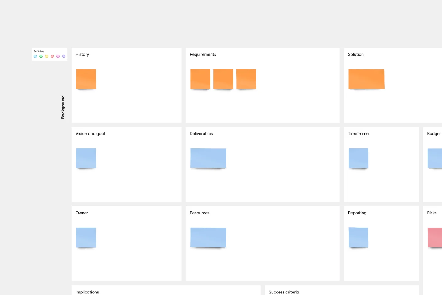
Project Proposal Template
For any type of project, the Project Proposal template can be a crucial step toward clarifying the context, goals, and scope of a project to get stakeholder buy-in. A project proposal outlines what you want to accomplish, your goals, and how you plan to achieve them. Generally, a project proposal gives the reader some context on the project, explains why it is important, and lists the actions that you will take to complete it. Project proposals have myriad uses. Often, businesses use project proposals to get external buy-in from a donor or outside stakeholder. But many companies draw up project proposals for internal buy-in too.
Presentation Template
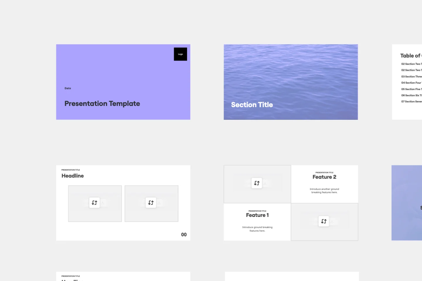
Presentation Template
At some point during your career, you’ll probably have to give a presentation. Presentations typically involve speaking alongside an accompanying slide deck that contains visuals, texts, and graphics to illustrate your topic. Take the stress out of presentation planning by using this presentation template to easily create effective, visually appealing slides. The presentation template can take the pressure off by helping your audience stay focused and engaged. Using simple tools, customize a slide deck, share slides with your team, get feedback, and collaborate.
Strategy Presentation Template
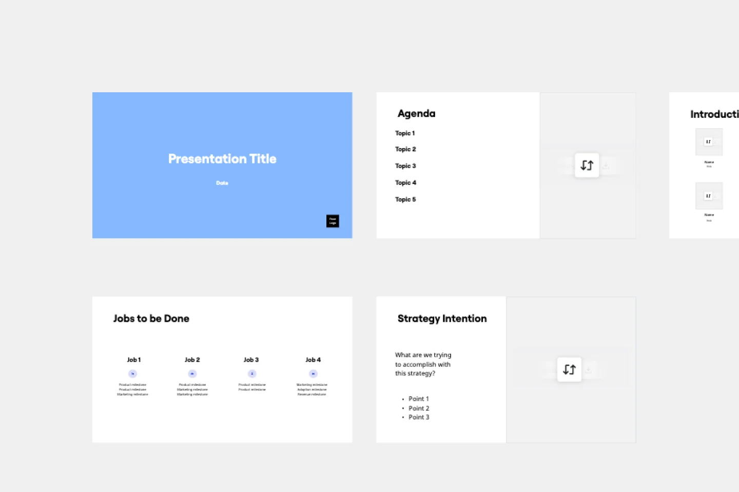
Strategy Presentation Template
Presenting your strategies is the best way to allow people to understand what the business will be focusing on in the future. Use this Strategy Presentation Template to communicate your strategic thinking and encourage collaboration.
Pie Chart Template
Pie Chart Template
Pie charts are an excellent way to present relationships between datasets graphically, where you can quickly compare information and see contrast right away. Professionals from many fields use pie charts to support their presentations and enrich their storytelling as it’s one of the most commonly used data charts.
Project Proposal Template
Project Proposal Template
For any type of project, the Project Proposal template can be a crucial step toward clarifying the context, goals, and scope of a project to get stakeholder buy-in. A project proposal outlines what you want to accomplish, your goals, and how you plan to achieve them. Generally, a project proposal gives the reader some context on the project, explains why it is important, and lists the actions that you will take to complete it. Project proposals have myriad uses. Often, businesses use project proposals to get external buy-in from a donor or outside stakeholder. But many companies draw up project proposals for internal buy-in too.
Presentation Template
Presentation Template
At some point during your career, you’ll probably have to give a presentation. Presentations typically involve speaking alongside an accompanying slide deck that contains visuals, texts, and graphics to illustrate your topic. Take the stress out of presentation planning by using this presentation template to easily create effective, visually appealing slides. The presentation template can take the pressure off by helping your audience stay focused and engaged. Using simple tools, customize a slide deck, share slides with your team, get feedback, and collaborate.
Strategy Presentation Template
Strategy Presentation Template
Presenting your strategies is the best way to allow people to understand what the business will be focusing on in the future. Use this Strategy Presentation Template to communicate your strategic thinking and encourage collaboration.