About the Bull’s Eye Diagram Template
When making a decision, teams sometimes struggle to adjudicate between priorities. This is especially true for high-stakes decisions, where every task on your to-do list feels like it could make or break a project. The inability to prioritize tasks can lead to gridlock among team members, inefficient meetings, and even low morale.
What is a bull’s eye diagram?
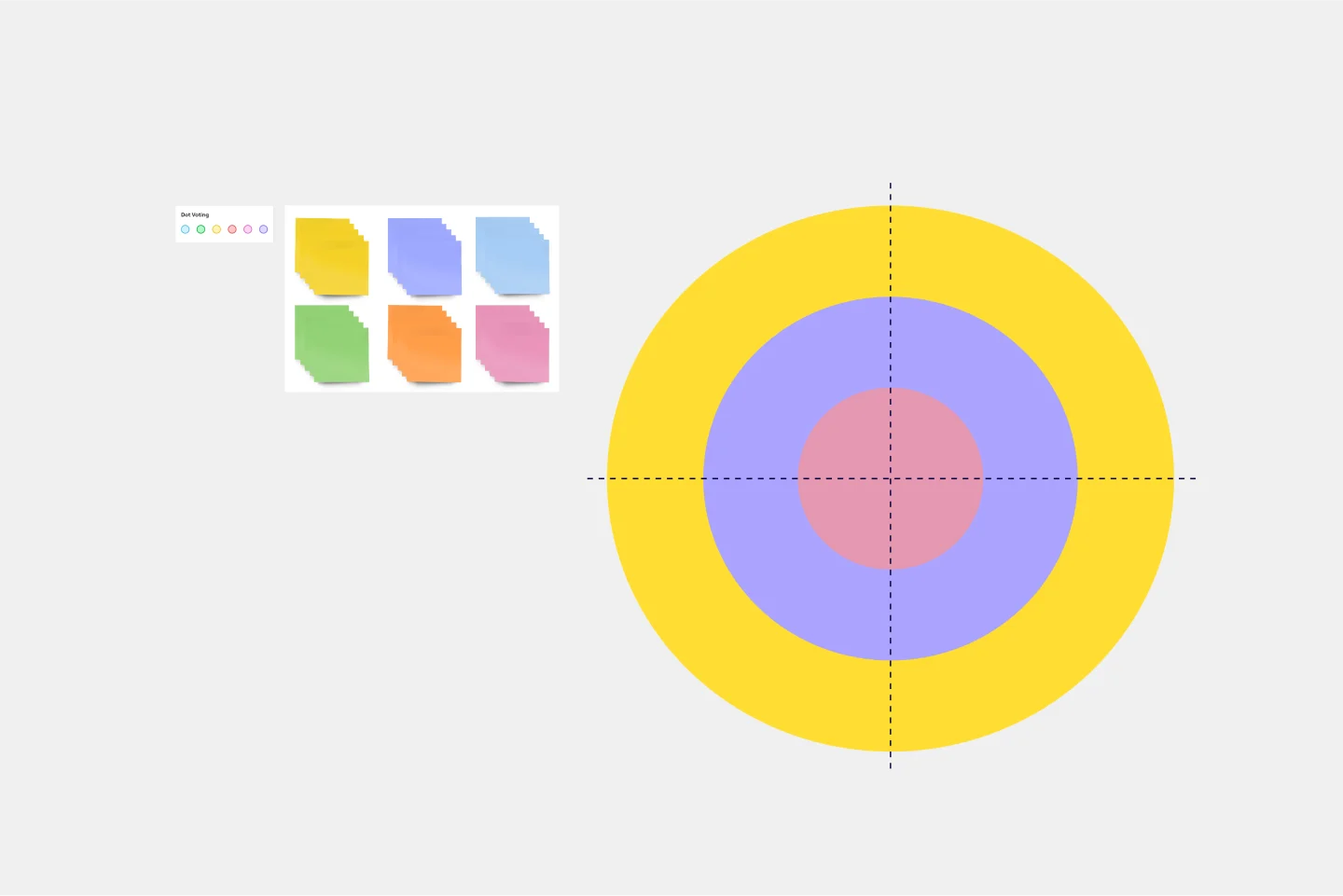
A bull’s eye diagram is a simple tool that enables teams to clarify priorities before making a decision. As the name suggests, the chart is set up to look like a bull’s eye. The innermost circle contains the highest-priority items, the middle circle contains medium-priority items, and the largest circle contains the lowest-priority items.
The beauty of the bull’s eye diagram is that it eliminates any possibility of gridlock. Teams struggle to make decisions and build momentum when every task on your list seems like it should be your highest priority. Overwhelmed by tasks, the team fails to move forward. But the bull’s eye diagram solves this problem simply by design. Once you slot high-priority items into the smallest circle, this forces you to shift lesser priorities around, and it becomes impossible to overwhelm your team with a long list of high-priority items.
When to use a bull’s eye diagram template
Use a bull’s eye chart any time you need to establish priorities, make critical decisions, or talk through a process and remove obstacles with your team. Gridlock occurs when teams struggle to make big decisions. Bull’s eye diagrams empower your team to break down a broader decision into smaller ones, slotting tasks into the diagram according to their level of importance.
Create your own bull’s eye chart
Listing tasks on an online canvas allows your team to quickly move around information related to new tasks added to the bull’s eye. Once you prioritize the tasks in the diagram, you can organize and rearrange them as needed. The diagram enables your team to see relationships and categories and reprioritize, too. The bull’s eye is an easily understood diagram that helps you clarify project priorities.
Making your own bull’s eye diagrams is easy. Miro is the perfect tool to create and share them. Get started by selecting the Bull’s Eye Diagram Template, then take the following steps to make one of your own.
Step 1: Establish a goal.
Before you start filling out the diagram, your team should align on a goal. Are you trying to make a decision? Overcoming a challenge? Articulate your goal before ironing out priorities.
Step 2: Make a list of tasks.
Think about all the tasks you’ll need to accomplish to achieve your goal. Don’t worry about putting them in any particular order. Timeline and prioritization are irrelevant at this stage. Just focus on getting the lists of tasks on paper. If you’re working through the bull’s eye diagram with your team, it’s helpful to give each team member a few minutes to make their own list. Then you can come together to consolidate the tasks into a master list.
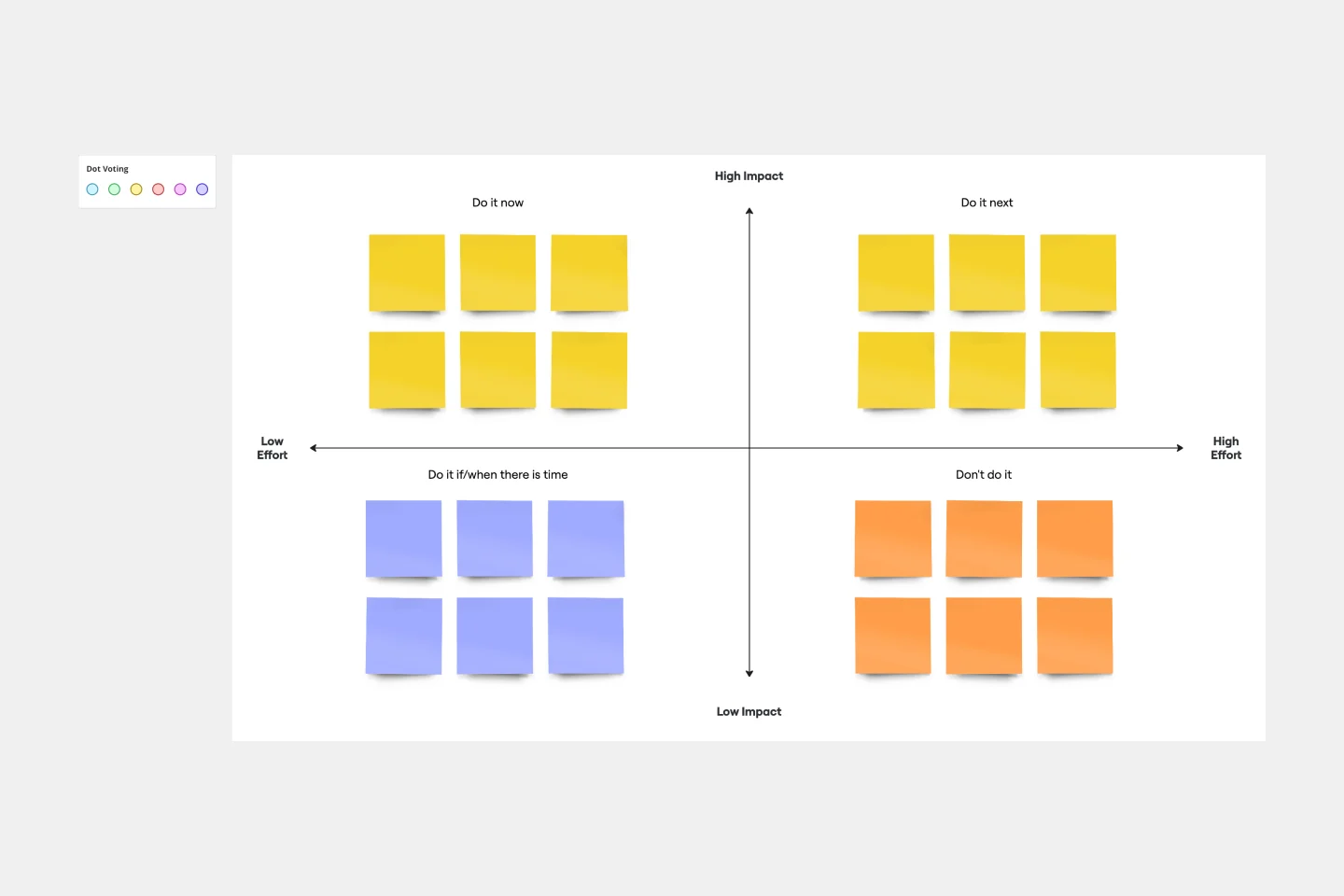
Step 3: Fill in the largest circle.
If you start by trying to make decisions about high-priority tasks, you might get stuck. Instead, focus on the lower-stakes items first by filling out the largest part of the circle. Refer back to your list of tasks. Are any of them unnecessary to complete your goal? Are there any “nice-to-haves” instead of “need-to-haves”? Give each team member a few minutes to think through the low-priority items before discussing as a group.
Step 4: Fill in the middle circle.
Next, think about medium-priority tasks. These items don’t need to be done immediately, but they are important for achieving your goal. The middle-priority circle is a bit smaller than the low-priority circle, which makes it more challenging to narrow down your tasks. Discuss with your teammates and come to a consensus.
Step 5: Fill in the smallest circle.
Now it’s time to figure out your mission-critical priorities. Since this is the smallest circle, you can only fit a few priorities in there. Refer back to your list of tasks. Think about high-priority tasks as necessary conditions. In other words, tasks you must accomplish in order to complete the project. Which two or three tasks are vital to your project? Talk it over with your team members, then complete your tasks and achieve your goal!

Miro
Your virtual workspace for innovation
Miro is an innovation workspace designed for teams of every size, everywhere, to dream, design, and build the future together. Our mission? To empower these teams to create the next big thing, powered by AI at every step of the way. Over 90 million users around the world rely on Miro to untangle complex ideas, put customer needs first, and deliver products and services faster. All supported by best-in-class security, compliance, and scalability.
Categories
Similar templates
Action Priority Matrix Template
Action Priority Matrix Template
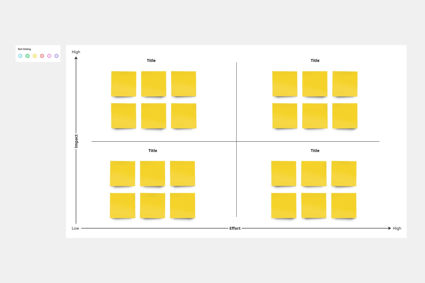
You and your teammates probably have more ideas than resources, which can make it difficult to prioritize tasks. Use an Action Priority Matrix to help choose the order in which you will work on your tasks, allowing you to save time and money and avoid getting bogged down in unnecessary work. An Action Priority Matrix is a simple diagram that allows you to score tasks based on their impact and the effort needed to complete them. You use your scores to plot each task in one of four quadrants: quick wins, major projects, fill-ins, and thankless tasks.
What's on Your Radar Template
What's on Your Radar Template
Do you or your team feel overburdened by tasks? Having trouble focusing on particular problems? What’s on Your Radar is a thought exercise in which you plot ideas according to their importance or relevance. Designers and teams use what’s on your radar to ensure that their ideas are within the scope of a given project. They also rely on the method to assess whether a given solution is likely to solve the problem at hand. But even if you’re not a designer, the method can help assign priorities and ground your ideas in reality.
Impact/Effort Matrix Template
Impact/Effort Matrix Template
Growing organizations have countless to-do’s and only so many hours in a day (or weeks before a big launch) to get them done. That’s where an impact effort matrix comes in. It gives you a quick visual guide to help prioritize your tasks and know exactly what’s worth doing. Using our template, you can create a matrix that organizes your activities into four main categories: quick wins that are low effort, effort-intensive projects that provide long-term returns, fill-ins that are low effort but low value, and time-wasters.
Action Priority Matrix Template
Action Priority Matrix Template
You and your teammates probably have more ideas than resources, which can make it difficult to prioritize tasks. Use an Action Priority Matrix to help choose the order in which you will work on your tasks, allowing you to save time and money and avoid getting bogged down in unnecessary work. An Action Priority Matrix is a simple diagram that allows you to score tasks based on their impact and the effort needed to complete them. You use your scores to plot each task in one of four quadrants: quick wins, major projects, fill-ins, and thankless tasks.
What's on Your Radar Template
What's on Your Radar Template
Do you or your team feel overburdened by tasks? Having trouble focusing on particular problems? What’s on Your Radar is a thought exercise in which you plot ideas according to their importance or relevance. Designers and teams use what’s on your radar to ensure that their ideas are within the scope of a given project. They also rely on the method to assess whether a given solution is likely to solve the problem at hand. But even if you’re not a designer, the method can help assign priorities and ground your ideas in reality.
Impact/Effort Matrix Template
Impact/Effort Matrix Template
Growing organizations have countless to-do’s and only so many hours in a day (or weeks before a big launch) to get them done. That’s where an impact effort matrix comes in. It gives you a quick visual guide to help prioritize your tasks and know exactly what’s worth doing. Using our template, you can create a matrix that organizes your activities into four main categories: quick wins that are low effort, effort-intensive projects that provide long-term returns, fill-ins that are low effort but low value, and time-wasters.