Azure Architecture Diagram Template
This diagram will help you visualize the combination of any data and build and deploy custom machine learning models at scale.
Available on Enterprise, Business, Education plans.
About the Azure Architecture Diagram template
The Azure Architecture Diagram Template will help you visualize and develop sophisticated, transformational apps using state-of-the-art machine learning algorithms. It will also allow you to create architecture diagrams, combine data, and build and deploy custom machine learning models at scale.
Keep reading to learn more about the Azure Architecture Diagram Template.
What is an Azure Architecture Diagram Template
The Azure Architecture Diagram Template, like any other network diagram, visually shows the steps of a given process, in this case, of the cloud architecture framework. The Azure Architecture Diagram has unique icons categorized into Stencils. Each Stencil focuses on a specific task to make it easier for users to access the right set of icons.
Azure helps to build, manage, and deploy applications. You can also use your preferred languages, frameworks, and infrastructure—even your data center and other clouds—to solve challenges large and small. Its framework consists of five pillars:
Cost optimization
Operational excellence
Performance efficiency
Reliability
Security
When to use the Azure Architecture Diagram Template
You can use the Azure Architecture Diagram Template to transform your data into actionable insights. Microsoft Azure has a wide range of use cases that it serves. Here you can see the most common examples:
Analytics
DevOps
Networks
Security
Databases
How to create an Azure Architecture Diagram Template
Here you can see some of the best practices when building your own Azure Architecture Diagram template.
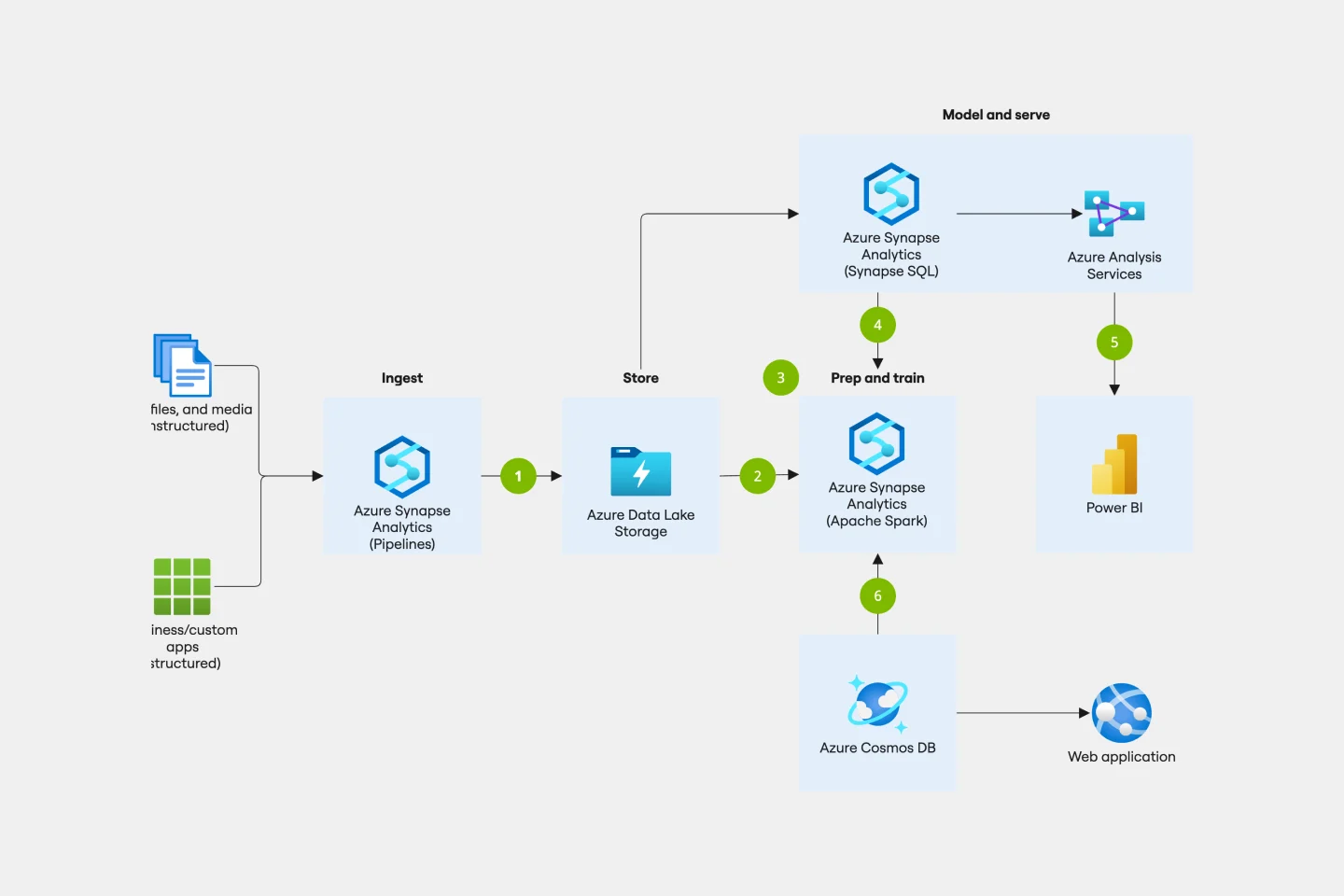
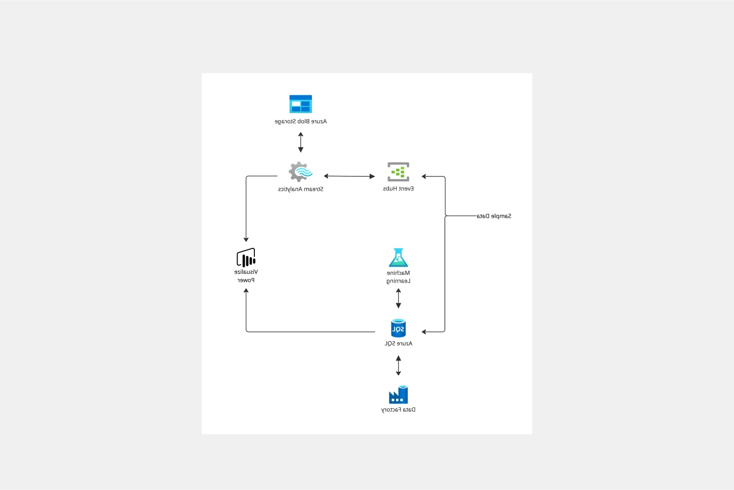
Data comes from various sources. Use the Events Hubs icon for high volumes of data ingestion or the Storage Account icon for data uploaded to Blob Storage.
Use Azure Function App icon to signalize calls to the Text Analytics API icon.
Add Azure Database for MySQL icon after Function Apps.
Add Azure Machine Learning Studio icon to show data is being further analyzed for more insights.
Add the Power BI icon to show how MySQL Power BI provides options for data visualization and analysis in Power BI.
Miro is the perfect cloud and network diagram tool with several available shape packs and templates, ranging from Azure cloud architecture to AWS to Cisco, and many more!
How do I create an Azure Architecture Diagram Template?
Creating an Azure Architecture Diagram in Miro is easy. You can use our Azure Architecture Diagram Template and customize it as you see fit. Once you have the diagram structure, you can start adding the icons. You can find the icons under our Azure Icon Set integration.
Get started with this template right now. Available on Enterprise, Business, Education plans.
SAFe Roam Board
Works best for:
Agile Methodology, Operations, Agile Workflows
A SAFe ROAM Board is a framework for making risks visible. It gives you and your team a shared space to notice and highlight risks, so they don’t get ignored. The ROAM Board helps everyone consider the likelihood and impact of risks, and decide which risks are low priority versus high priority. The underlying principles of SAFe (Scaled Agile Framework) are: drive cost-effective solutions, apply systems thinking, assume that things will change, build incrementally, base milestones on evaluating working systems, and visualize and limit works in progress.
Yes No Flowchart Template
Works best for:
Diagramming
The Yes-No Flowchart Template is a simple and efficient tool that helps to simplify complex decision-making processes into clear and easy-to-follow steps. This template uses standard shapes to illustrate processes, decisions, and outcomes, with arrows that guide users from one action point to the next based on binary 'yes' or 'no' decisions. Its most prominent benefit is its ability to bring clarity to decision-making. By presenting processes visually, teams can effortlessly understand and navigate complex scenarios, ensuring that each step is transparent and reducing the potential for misunderstandings or missteps.
Pie Chart Template
Works best for:
Education, Operations
Pie charts are an excellent way to present relationships between datasets graphically, where you can quickly compare information and see contrast right away. Professionals from many fields use pie charts to support their presentations and enrich their storytelling as it’s one of the most commonly used data charts.
Chat-Bot
Works best for:
Diagramming
The Chat Bot template is a visual tool for designing and mapping out chatbot interactions and functionalities. It provides a structured framework for visualizing conversation flows, user inputs, and bot responses. This template enables teams to collaborate on designing chatbot experiences that are intuitive and user-friendly, driving engagement and satisfaction. By promoting clarity and alignment, the Chat-Bot template empowers organizations to create effective chatbot solutions that meet user needs and business objectives.
Kubernetes Application Template
Works best for:
Software Development, Diagrams
Use the Kubernetes Application template to manage enterprise-ready containerized applications better. You can now get your team more agile when dealing with portability, licensing, and consolidated billing. The Kubernetes Application template allows you to run deployments anywhere, facilitating the management of your applications. Try it out and see if it’s the best fit for you and your team.
Precedence Diagram
Works best for:
Diagramming, Mapping
The Precedence Diagram Template offers a visual tool that maps out project activities and their interrelated sequences. This diagram empowers teams to recognize and anticipate workflow structures by illustrating the connections and dependencies among tasks.