
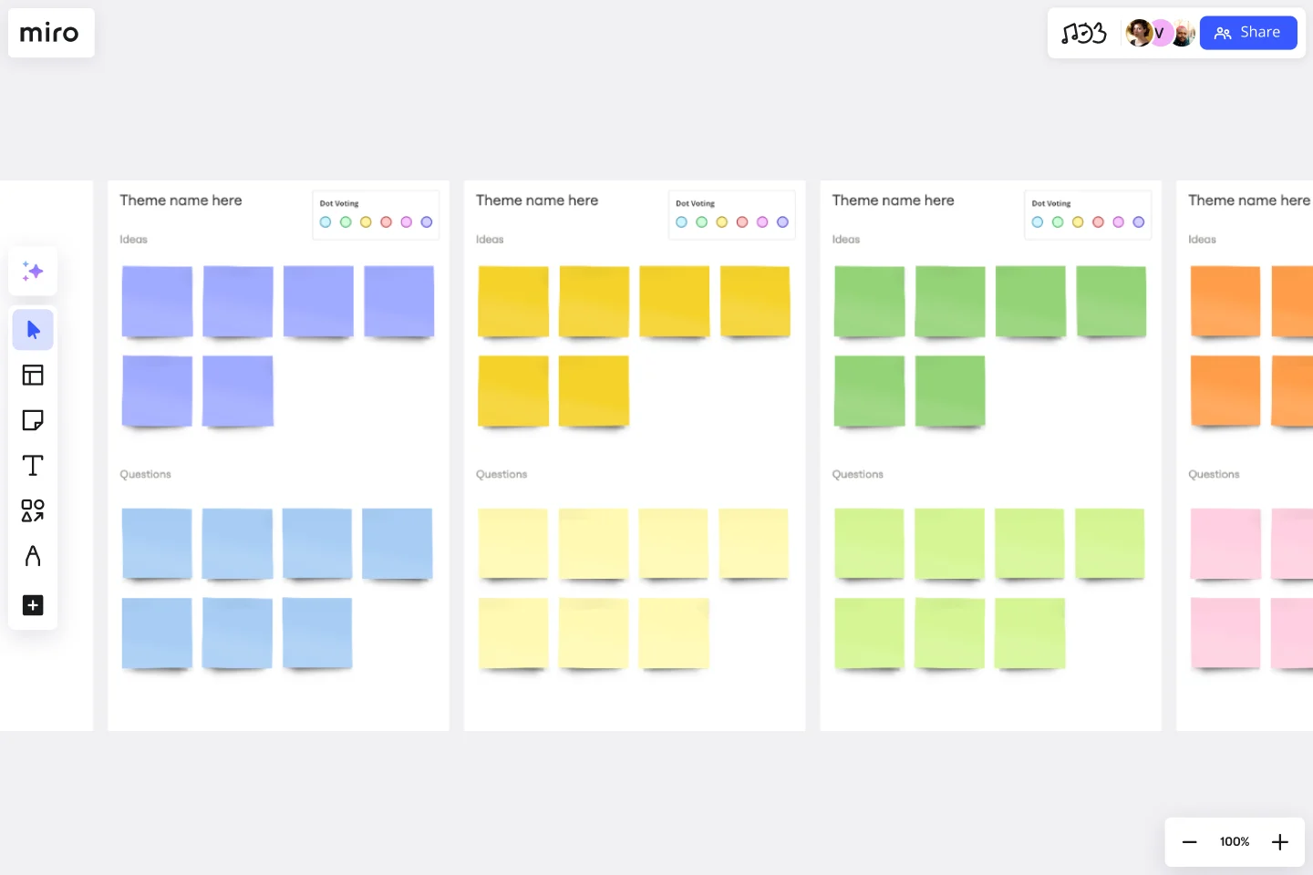
Affinity Diagram Template
Organize and cluster ideas and data in order to effectively develop solutions.
About the Affinity Diagram template
The affinity diagram template can help you organize and consolidate ideas from your brainstorming sessions. An affinity diagram is a tool that can lead to more innovative and better solutions when working through complex problems. But it’s not just ideal for brainstorms — this is a great template to use when you need to reach consensus or analyze data such as survey results.
What is an affinity diagram?
An affinity diagram is a visual brainstorming tool that allows teams to organize ideas according to their natural relationships. We’ve all participated in brainstorming sessions that seemed to go nowhere, and with so many people sharing a large number of ideas and perspectives, it can be difficult to distill these conversations into a coherent takeaway. This is where an affinity diagram comes in handy.
Benefits of using an affinity diagram template
You can use an affinity diagram to generate, organize, and consolidate information that comes out of a brainstorming session. Whether you’re building a product, working through a complex problem, establishing a process, or piecing apart an issue, an affinity diagram is a useful and simple framework.
Incorporate everyone’s perspective
An affinity diagram gives each team member the opportunity to share their thoughts and ideas about the topic. By collecting everyone’s brainstorming ideas, an affinity diagram functions as a visual representation of a brainstorm that everyone can add to.
Find connections between ideas
Affinity diagrams are also a great way to discover novel connections between various components of a project. Synthesizing ideas into a simple visual framework allows teams to develop new solutions that they might otherwise miss.
Organize team thoughts and ideas
Finally, an affinity diagram template is a valuable tool of an organization that divides a project into various discrete components and allows you to dive deeper into each individual component. Organizing thoughts in this way can help you break up tasks and delegate responsibility.
When to use an affinity diagram template
Teams and organizations use affinity diagrams in a variety of situations. When your brainstorming session feels like it’s devolving and there are too many ideas to capture, or when the issues are too large and complex to grasp, you can use an affinity diagram to cut through the chaos.
But it’s not only useful during chaotic meetings; you can also use an affinity diagram whenever a consensus is needed, when analyzing data such as survey results when grouping ideas into themes, or when organizing datasets.
Our guide on mind mapping vs affinity diagrams can provide an additional perspective for when you need decide on the right tool for your team's needs.
How to use an affinity diagram template
Making an affinity diagram with your team is easy. Get started by selecting this affinity diagram template, then go through the following steps:
Step 1: Ideation
The first step of the process is to start recording the ideas that you’d like to sort into categories. Get everyone in the team involved and ask them to put forward a few ideas.
Step 2: Diagramming
Next, examine the ideas and try to find related concepts. Then, discuss with the group and start to tentatively draw connections between ideas. Invite team members to add sticky notes sharing their perspectives. When you notice related concepts, group them together. Repeat this step until you’ve grouped all the concepts.
Step 3: Grouping
Repeat step 2 until you’ve grouped all the concepts. It’s okay if there are concepts that seem to defy a grouping. You can return to those later.
Step 4: Team discussion
Discuss with your team and make sure everyone is on the same page. Do you agree with the groups? How should you label them? Do you need to make any changes?
Step 5: Synthesize ideas
Finally, combine these groups into “supergroups”, to synthesize ideas into a more cohesive whole. The completed affinity diagram can be used to enhance future project management and inform decision-making.
What is the purpose of an affinity diagram?
The purpose of an affinity diagram is to generate ideas and organize them in a manner that draws out the various connections and relationships between different ideas. Affinity diagrams are visual brainstorm tools, but with a focus more on the connections between ideas.
When are affinity diagrams used?
Affinity diagrams are used by businesses and organizations to analyze data, generate ideas, and organize projects or analyses. Any time you want to more clearly organize data or ideas to generate some useful conclusions, an affinity diagram can be used.
How do you use affinity diagrams?
You use the affinity diagram template after a brainstorming session or ideation. Afterward, group the ideas, concepts, and data gathered into clusters and see the connection between them. The affinity diagram template is done when you managed to synthesize your ideas up to the point you can inform decision-makers and identify solutions to the proposed problem.
Get started with this template right now.
Johari Window Model
Works best for:
Leadership, Meetings, Retrospectives
Understanding — it’s the key to trusting others better and yourself better as well. Built on that idea, a Johari Window is a framework designed to enhance team understanding by getting participants to fill in four quadrants, each of which reveals something they might not know about themselves or about others. Use this template to conduct a Johari Window exercise when you’re experiencing organizational growth, to deepen cross-functional or intra-team connections, help employees communicate better, and cultivate empathy.
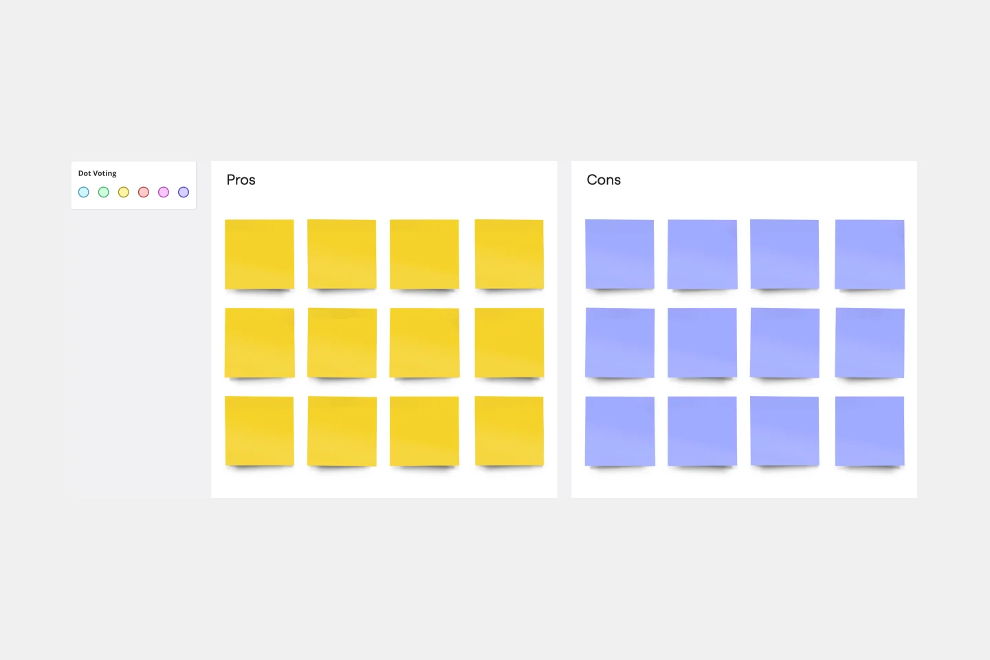
Pros and Cons List Template
Works best for:
Decision Making, Documentation, Strategic Planning
A pros and cons list is a simple but powerful decision-making tool used to help understand both sides of an argument. Pros are listed as arguments in favor of making a particular decision or action. Cons are listed arguments against it. By creating a list that details both sides of the argument, it becomes easier to visualize the potential impact of your decision. To make your pros and cons list even more objective, it can help to weight each pro and con against the others. You can then present your decision with confidence, making a strong argument for why it’s the right one.
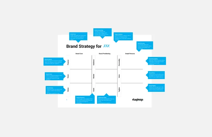
Brand Strategy Template
Works best for:
Marketing
Develop a brand strategy for new and existing brands with this fully guided Brand Strategy Template. Find new ways to build your brand and set your business up for success.
Infographic Template
Works best for:
Marketing, Desk Research, Documentation
As we bet you’ve experienced, data can get pretty dense and dry. But you need it to be compelling, memorable, and understandable. The solution? Infographics. These are tools that let you present information in a visually striking way and turn quantitative or qualitative data into stories that engage and resonate. Whoever you’ll be presenting to — customers, donors, or your own internal teams — our template will let you design an infographic that combines text and visuals to break down even the most complicated data.
Agenda Template
Works best for:
Project Management, Meetings, Workshops
Even when you’ve hosted meetings for years, hosting them online is different. Keeping them structured, purposeful, and on-task is key. That all starts with having a detailed agenda, and this template makes it so easy for you to create one.
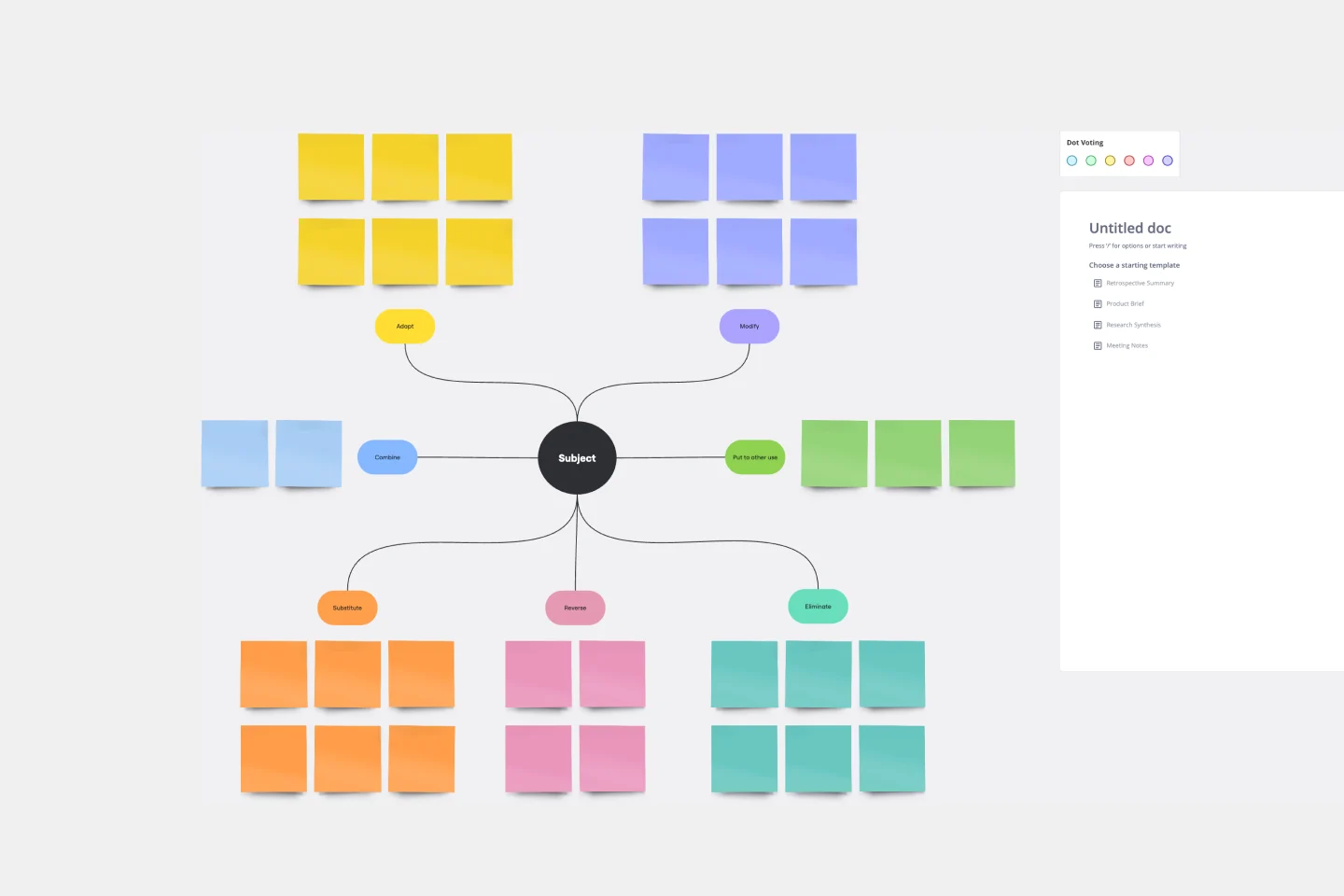
SCAMPER Model
Works best for:
Ideation, Operations, Brainstorming
Is your team in a rut? Have you had a lingering problem that can’t seem to be solved? First introduced in 1972, SCAMPER. is a brainstorming method developed by Bob Eberle, an author of creativity books for young people. This clever, easy-to-use method helps teams overcome creative roadblocks. SCAMPER walks you through seven questions that are meant to encourage your team to approach a problem through seven unique filters. By asking your team to think through a problem using this framework, you’ll unlock fresh, innovative ways to understand the problem you’re trying to solve.